
Who Says?
Who says you don’t make friends with salad?
A custom salad ordering app designed to accommodate diverse food restrictions and user expectations
Client & Industry
- Camila G.
- Food / Health / Lifestyle
Time Frame
1 Week
Aug 2025
Role
UX/UI Designer & Branding
Tools
Figma, Illustrator & Procreate
Overview
When healthy eating feels easier
What is Who Says?
Who Says? is a custom salad ordering app designed to help users build personalised salads based on their taste and dietary needs. Initiated by social entrepreneur Camila G., the concept reimagines healthy fast food as a simple and stress-free experience, supporting mindful eating through clear, intuitive customization without unnecessary complexity.
Background
When Customisation Creates Friction
Why this project matters
As dietary needs become more diverse, food-ordering experiences are expected to handle increasing complexity. However, many healthy food apps still introduce friction by failing to clearly communicate options and ingredient information.
This project focuses on addressing that gap by exploring how clarity and structure can improve decision-making in food customisation.
The Challenge
Balancing Personalisation with Clarity
Defining the problem to solve
Key Constraints
- Highly customisable food options
- Diverse dietary restrictions
- Fast and effortless ordering experience
The challenge was to translate complexity into clarity without compromising user control.
Design Process
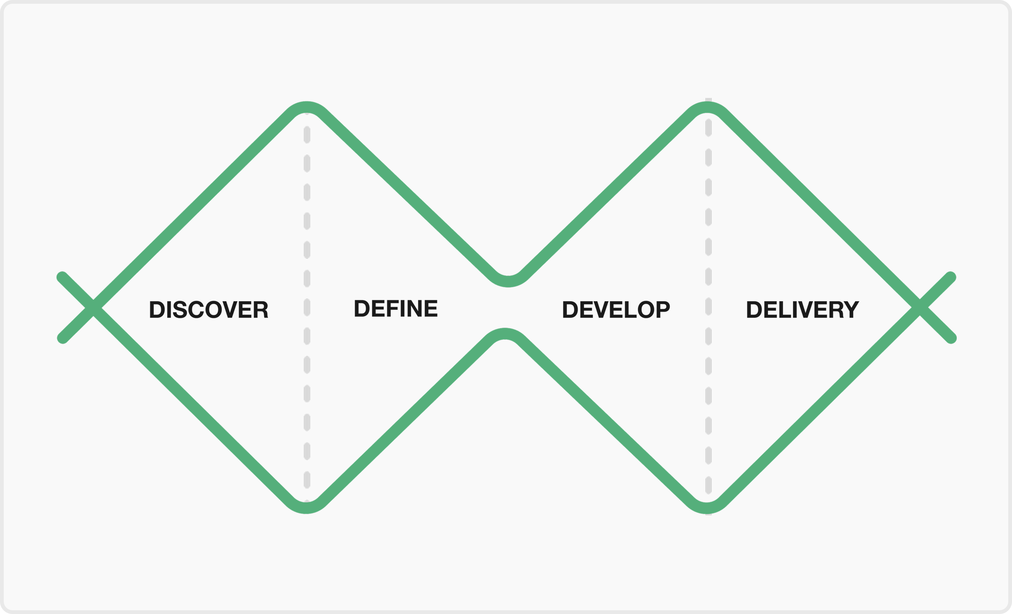
Diamond Design Process
Discover
Users Needs & Insights
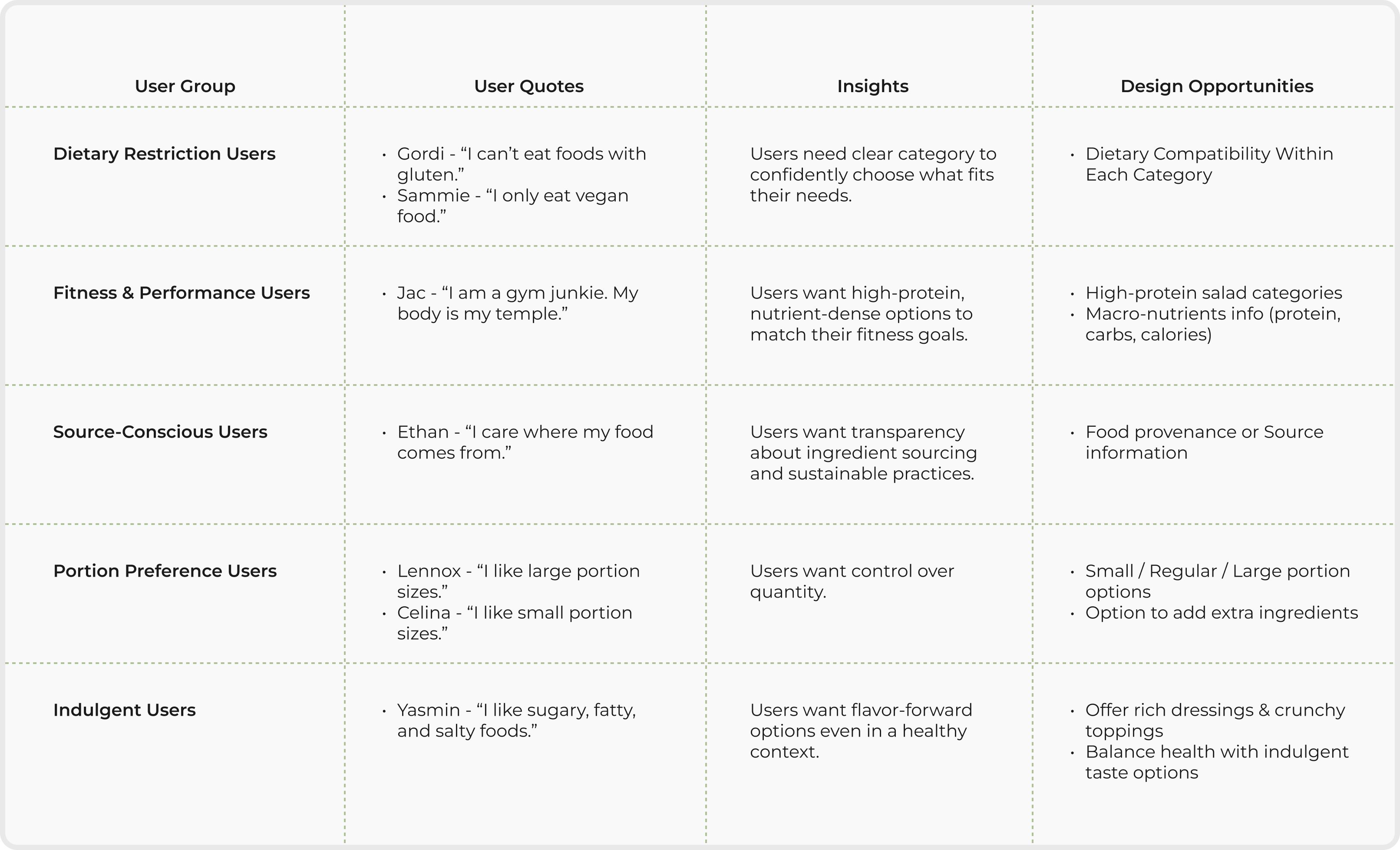
Insights
Based on the seven personas provided by the client, I mapped out their needs and translated them into actionable features for the app.
Discover
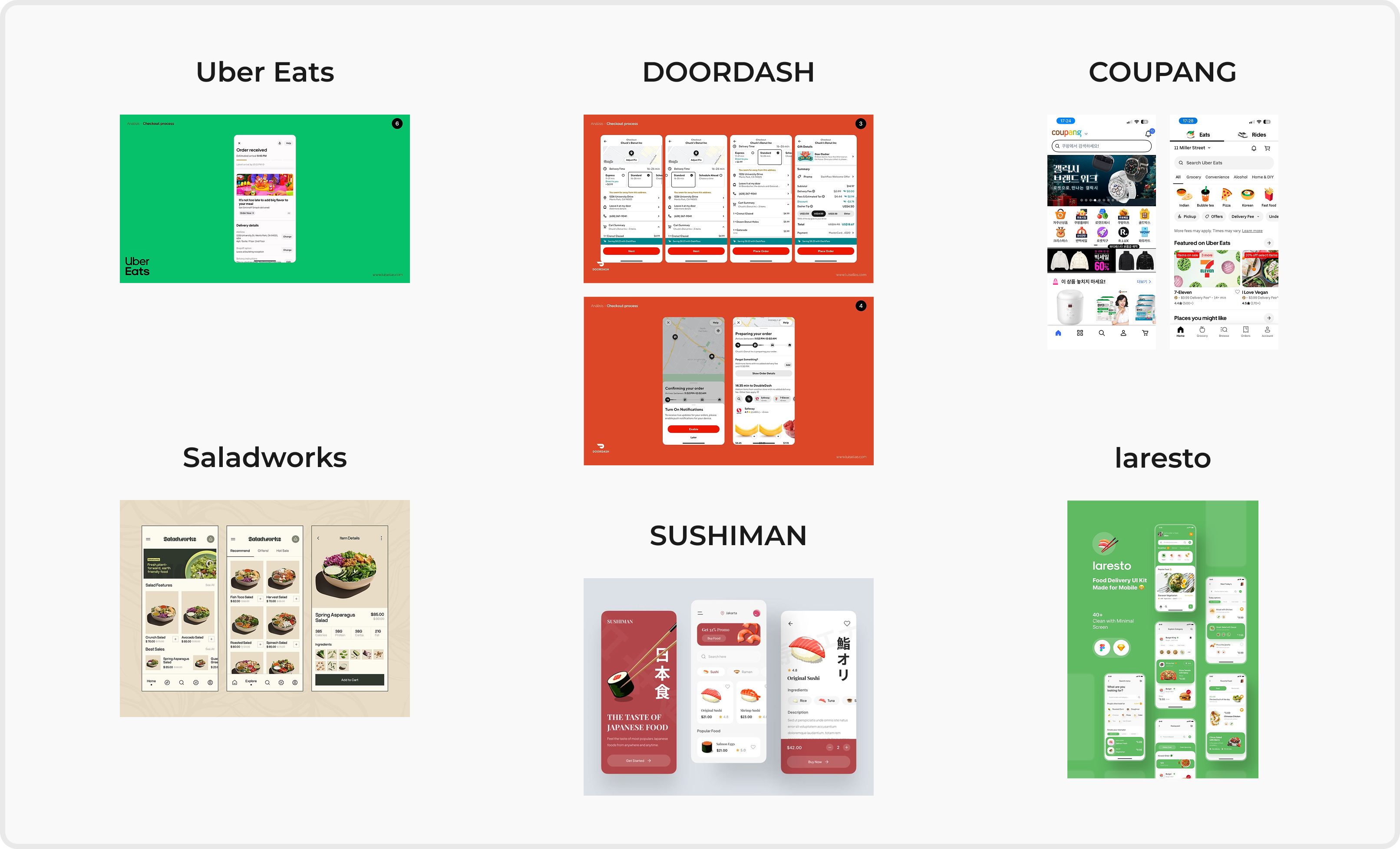
UI Pattern Exploration
Reviewing existing design approaches
An exploration of existing interfaces to understand how complex customisation, dietary information and ordering experience can be communicated clearly through UI patterns.
Define
Refined Problem Statement
What we need to solve
What we need to solve
Users with diverse dietary needs feel overwhelmed when customizing food due to unclear information and too many choices.
The Challenge
Design Goals
What success looks like
- Reduce decision fatigue during customisation
- Support confident and informed choices
- Maintain a fast ordering experience
Define
Feature Prioritization
What to build and WHY
Step-by-step bowl customisation
Reduces cognitive load by breaking decisions into manageable steps
Dietary indicators & filters
Helps users quickly assess suitability without scanning all ingredients
Guided ingredient selection
Balances freedom with structure
Develop
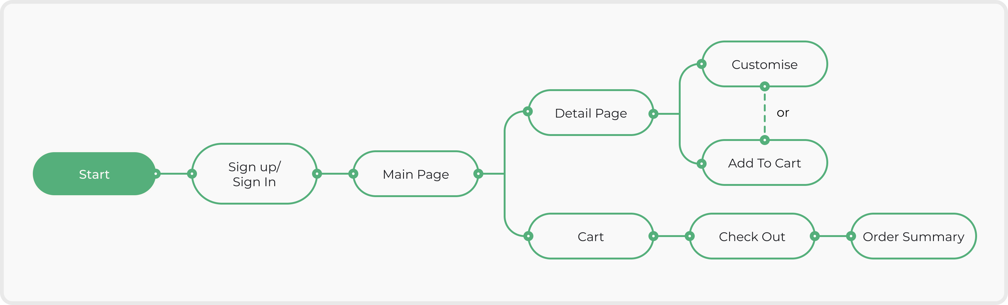
User Flow
Develop
Wireframe Sketch
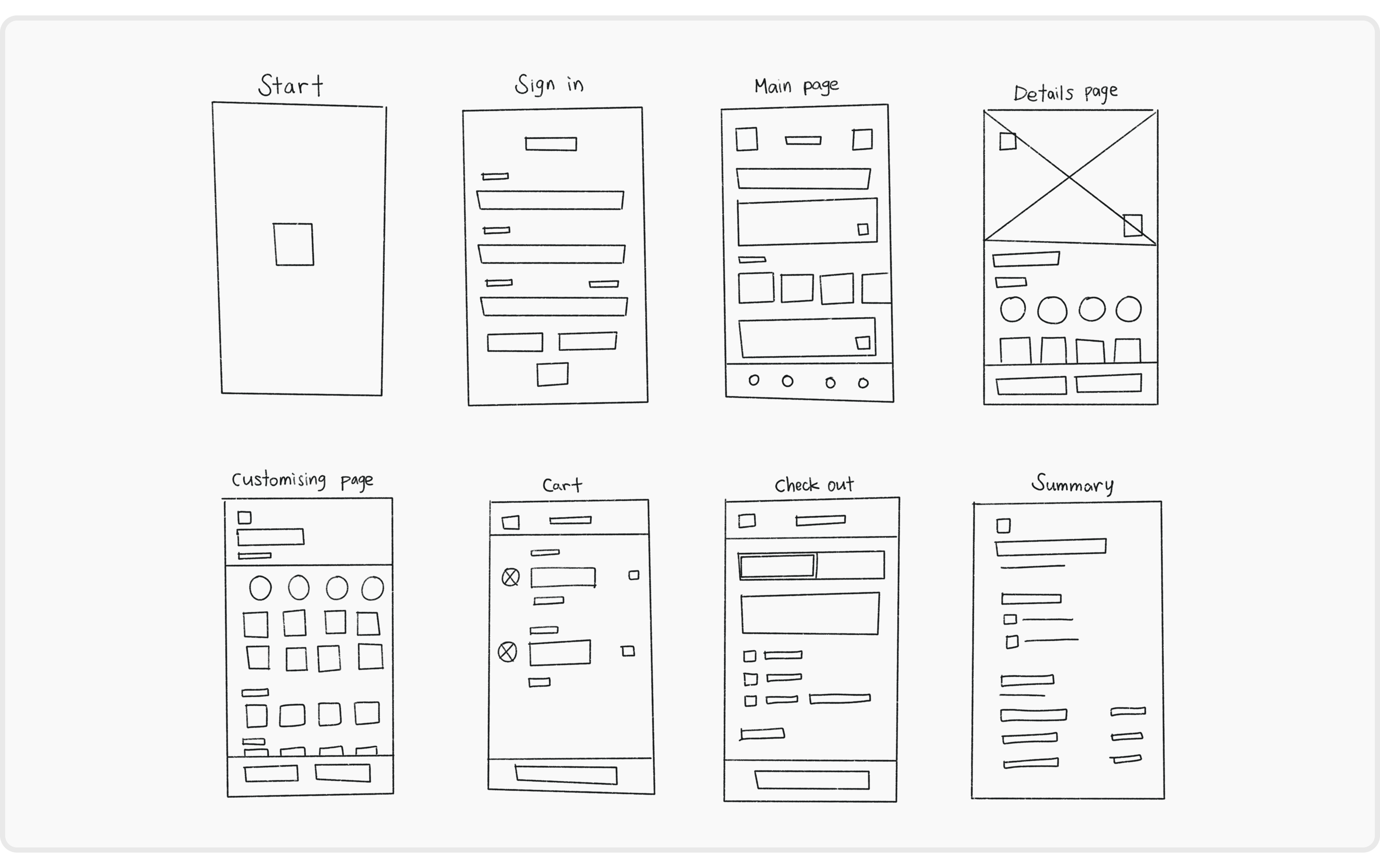
Develop
Lo-Fi Prototype before A/B Testing
Develop
A/B Testing
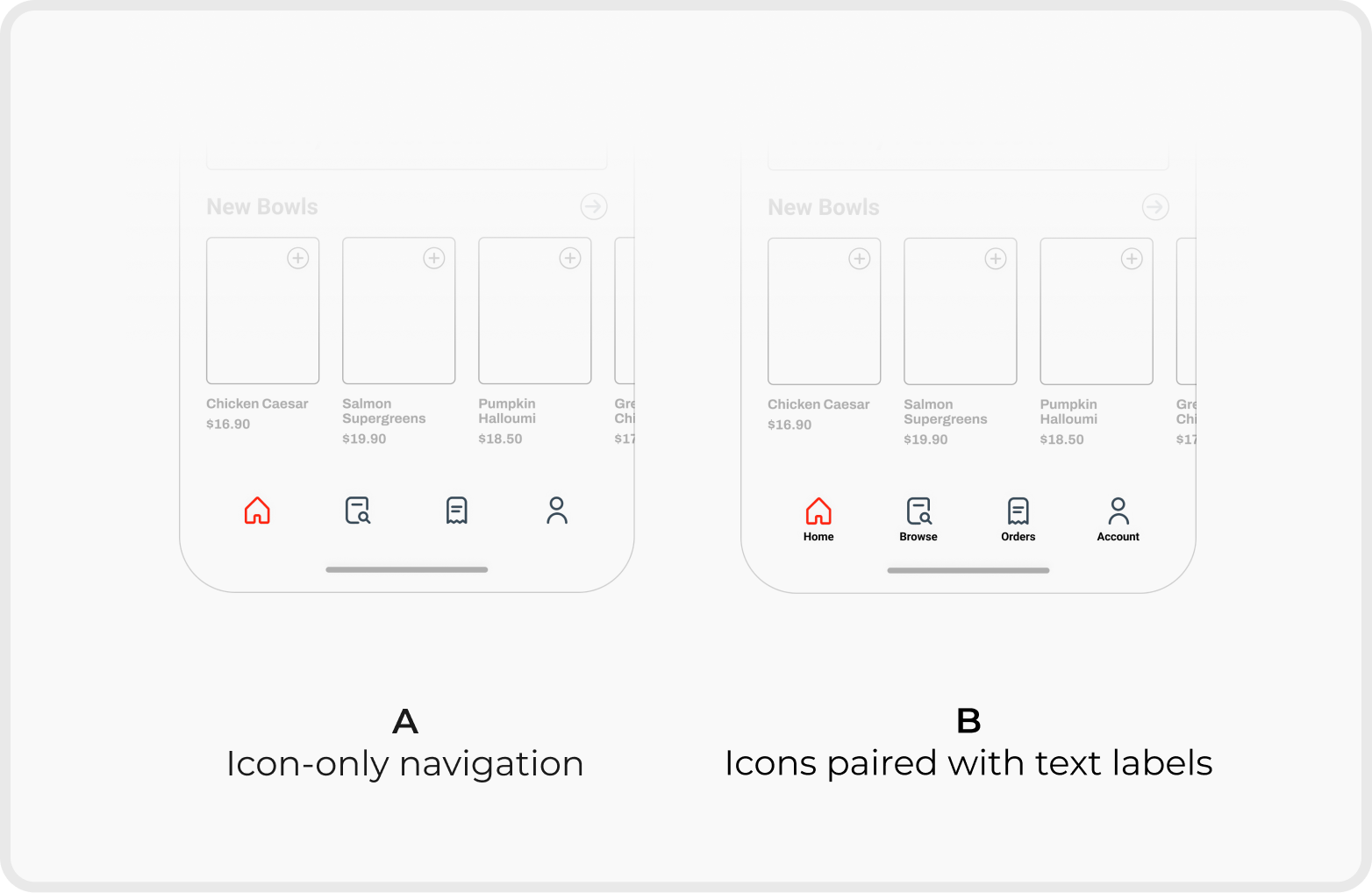
Navigation Clarity
ResultOption B improved way-finding and reduced guesswork across the app.
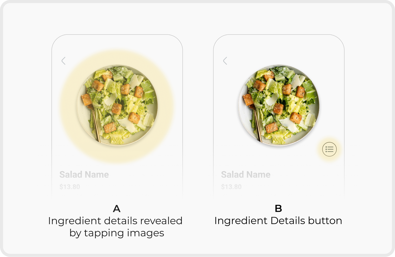
Ingredient Information Visibility
ResultOption B improved discoverability by providing a clear interaction trigger and reducing hesitation during customisation.
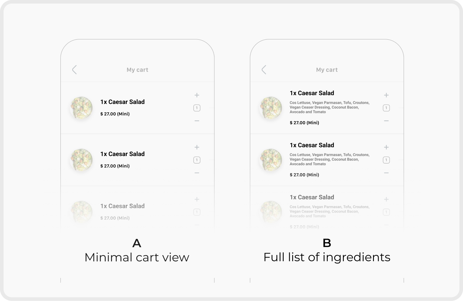
Order Transparency in Cart
ResultOption B increased user confidence by clearly communicating what was included in the final order.
Deliver
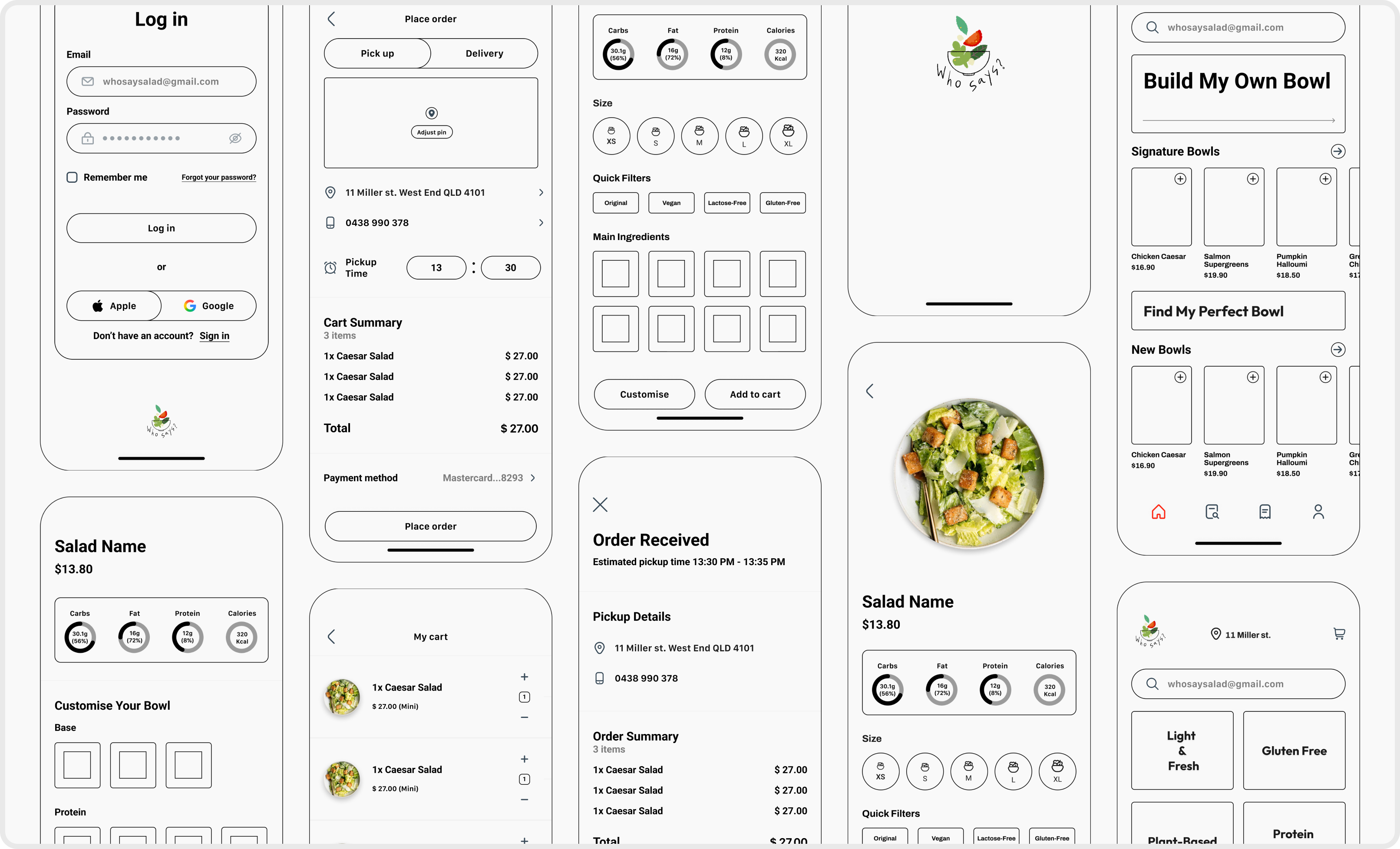
Final Prototype
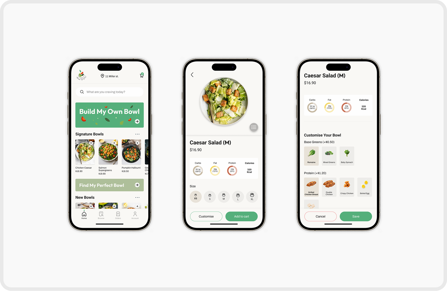
Start & Log In Page
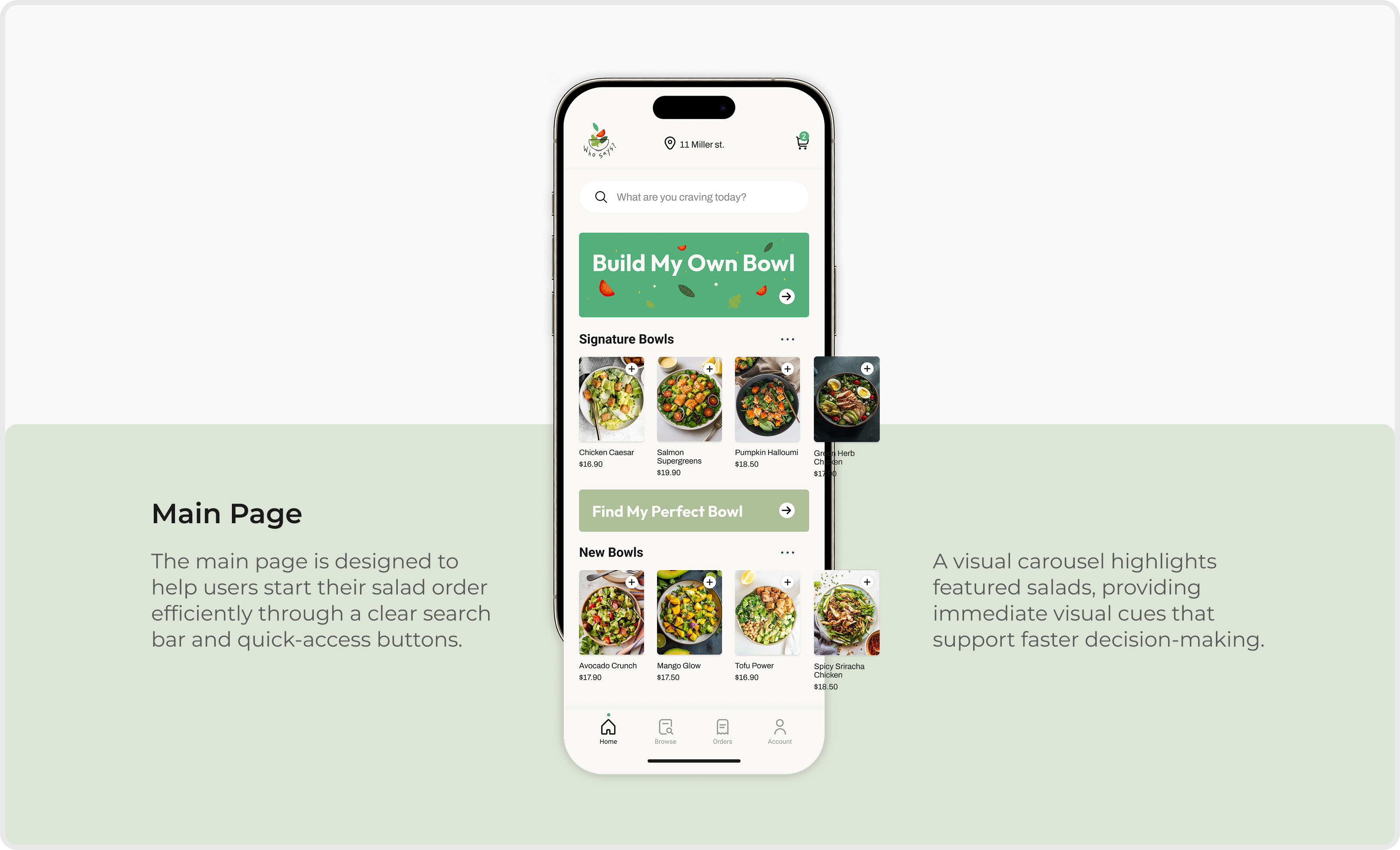
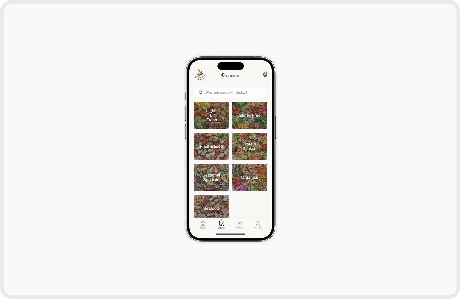
Browse Page
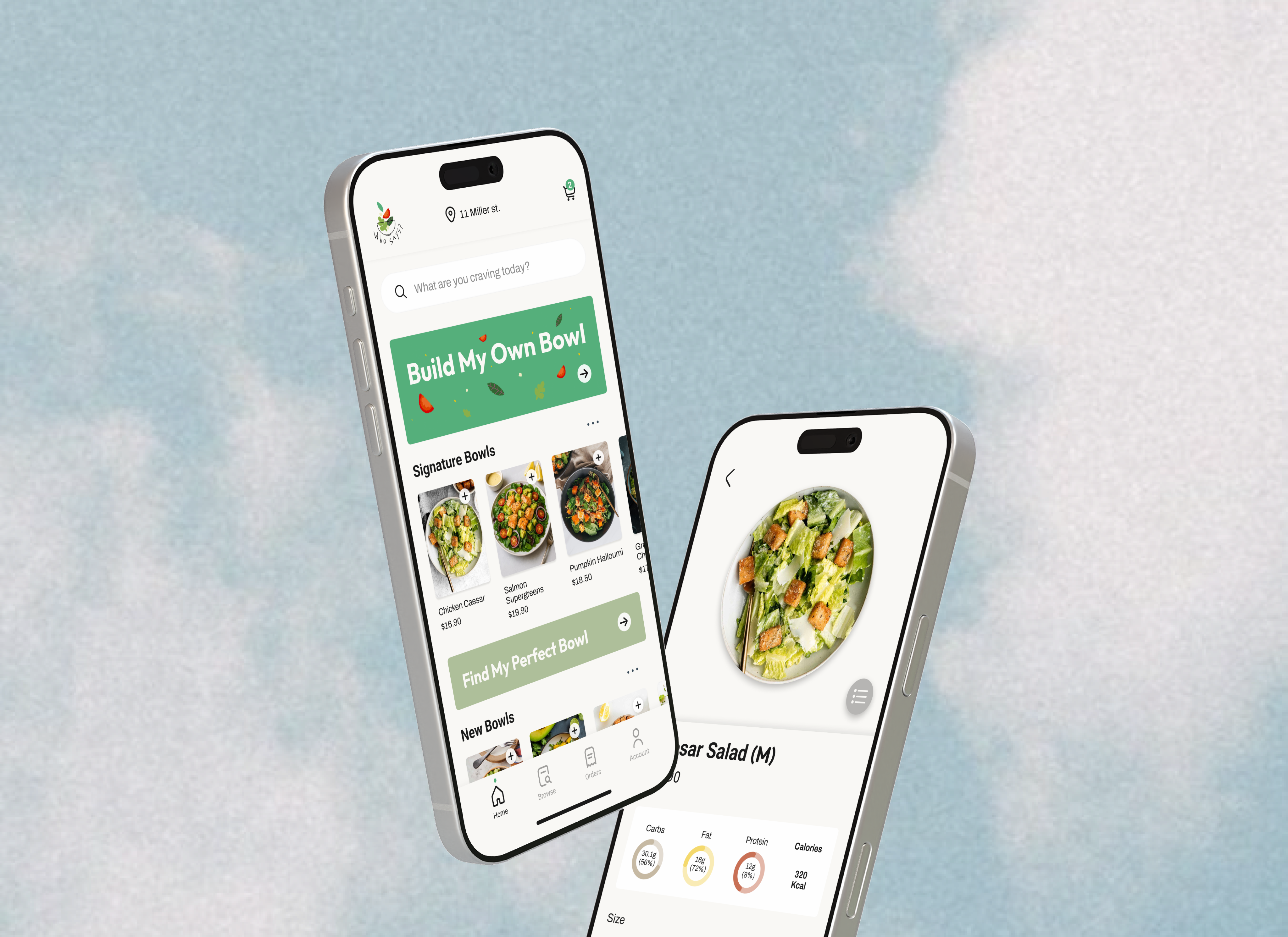
Salads are organised into clear categories, allowing users to quickly find options that match their needs or dietary preferences.
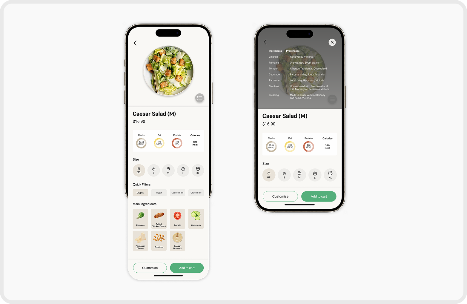
Salad Detail Page
Macro nutrients, ingredients, and provenance are presented visually to build trust and support informed decision-making.
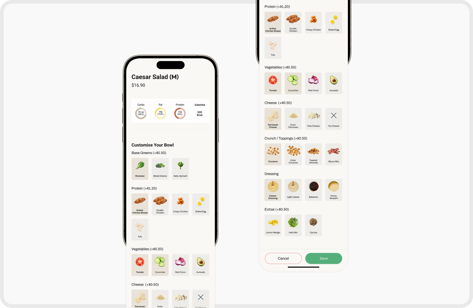
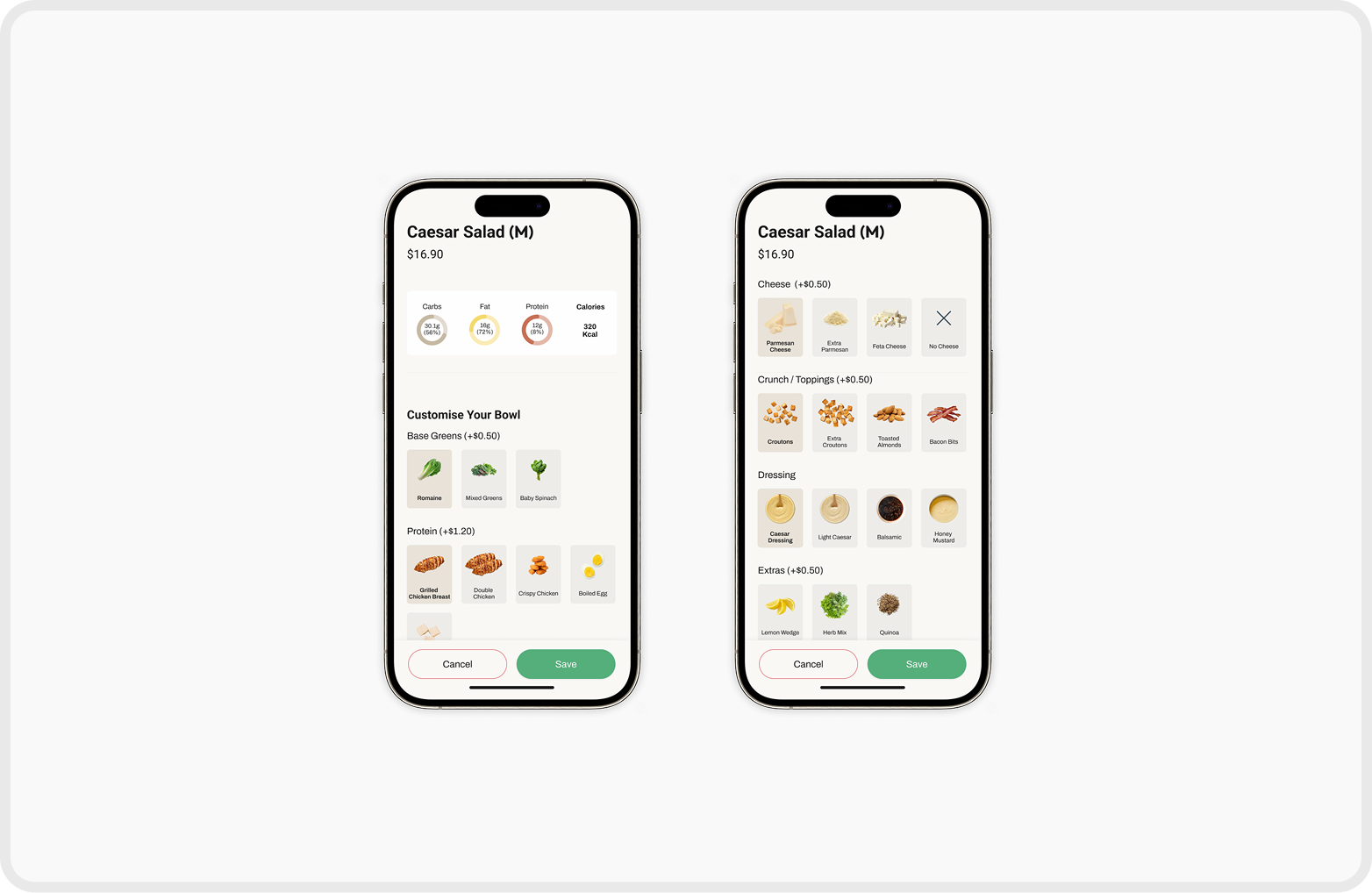
Customise Page
Users can adjust ingredients and portion sizes for greater flexibility.
Core ingredients remain fixed to preserve each bowl’s identity, while nutrients and pricing update dynamically with every change.
Customise Page
Users can adjust ingredients and portion sizes for greater flexibility.
Core ingredients remain fixed to preserve each bowl’s identity, while nutrients and pricing update dynamically with every change.
Deliver
Final Prototype
This prototype was created based on the user flow with key interactions rather than full functionality.
Deliver
Branding
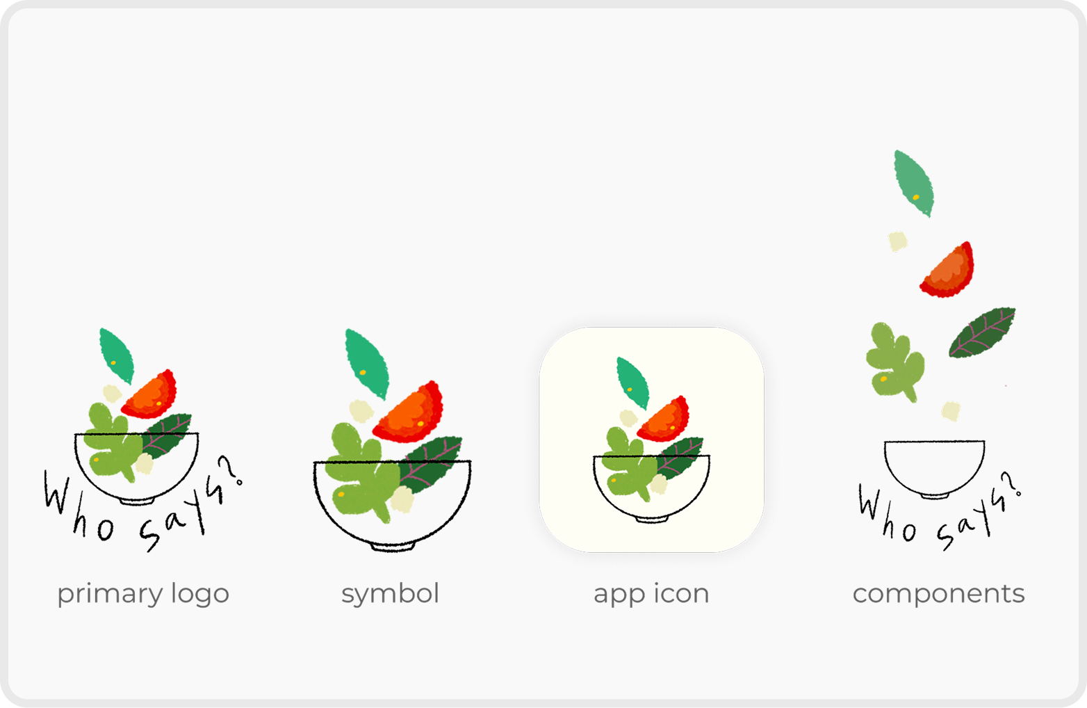
Logo
The Who Says? logo features a salad bowl with vegetables falling into it, symbolising the app's inclusivity. The mix of ingredients represents the variety of tastes and preferences the platform caters to, highlighting its focus on customisation and diversity.
UI Design
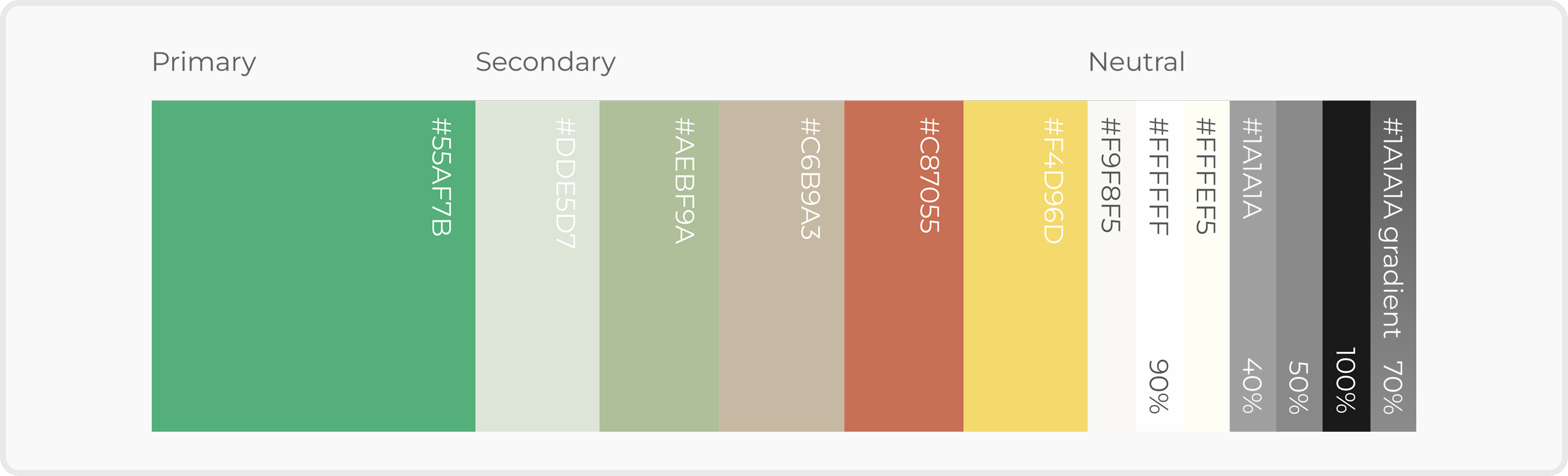
Colour System
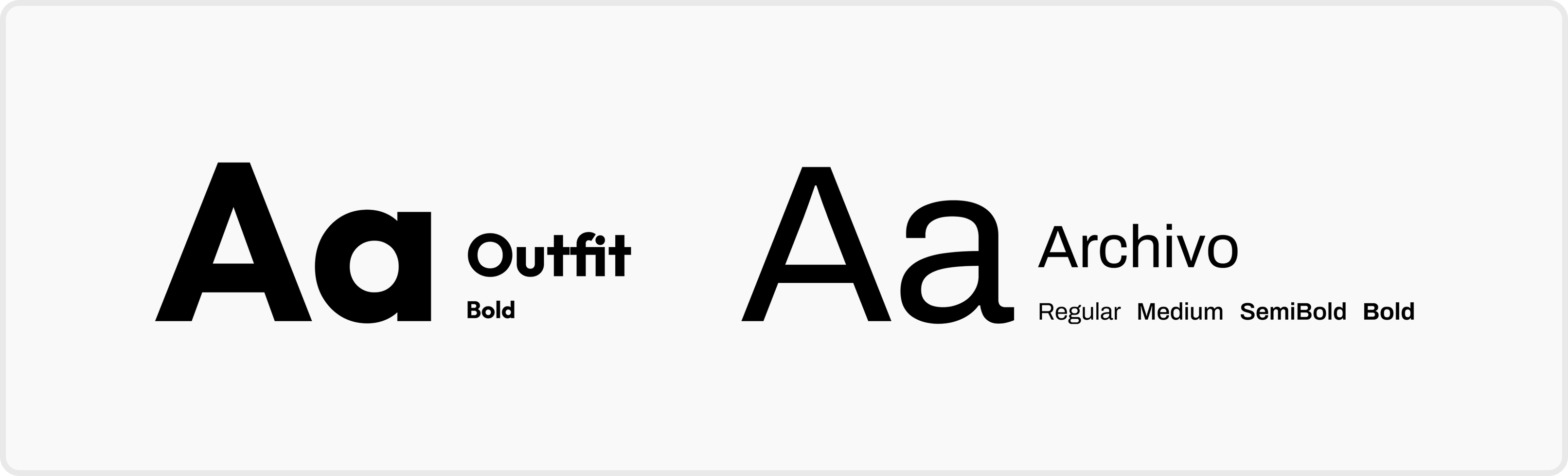
Font
Reflection
What I Learned
Minimal does not always mean clear.
Through A/B testing, I learned that reducing text and visual cues for the sake of minimalism can hurt clarity. Users perceived interfaces with clearer labels and explicit information as more supportive and trustworthy, even when the design was less visually minimal.
This reinforced that effective UX prioritises confidence and understanding over visual simplicity—especially in decision-heavy experiences.
What I would do differently
Designing with validation, not assumptions
I would invest more time in early market research and usability testing, even with rough wireframes. Validating assumptions sooner would enable faster iteration and more user-informed design decisions.
HOME
ABOUT
Who Says?
Who says you don’t make friends with salad?
A custom salad ordering app designed to accommodate diverse food restrictions and user expectations
Client & Industry
- Camila G.
- Food / Health / Lifestyle
Time Frame
1 Week
Aug 2025
Role
UX/UI Designer & Branding
Tools
Figma, Illustrator & Procreate
Overview
When healthy eating feels easier
What is Who Says?
Who Says? is a custom salad ordering app designed to help users build personalised salads based on their taste and dietary needs. Initiated by social entrepreneur Camila G., the concept reimagines healthy fast food as a simple and stress-free experience, supporting mindful eating through clear, intuitive customization without unnecessary complexity.
Background
When Customisation Creates Friction
Why this project matters
As dietary needs become more diverse, food-ordering experiences are expected to handle increasing complexity. However, many healthy food apps still introduce friction by failing to clearly communicate options and ingredient information.
This project focuses on addressing that gap by exploring how clarity and structure can improve decision-making in food customisation.
The Challenge
Balancing Personalisation with Clarity
Defining the problem to solve
Key Constraints
- Highly customisable food options
- Diverse dietary restrictions
- Fast and effortless ordering experience
The challenge was to translate complexity into clarity without compromising user control.
Design Process
Diamond Design Process
Discover
Users Needs & Insights
Insights
Based on the seven personas provided by the client, I mapped out their needs and translated them into actionable features for the app.
Discover
UI Pattern Exploration
Reviewing existing design approaches
An exploration of existing interfaces to understand how complex customisation, dietary information and ordering experience can be communicated clearly through UI patterns.
Define
Refined Problem Statement
What we need to solve
What we need to solve
Users with diverse dietary needs feel overwhelmed when customizing food due to unclear information and too many choices.
The Challenge
Design Goals
What success looks like
- Reduce decision fatigue during customisation
- Support confident and informed choices
- Maintain a fast ordering experience
Define
Feature Prioritization
What to build and WHY
Step-by-step bowl customisation
Reduces cognitive load by breaking decisions into manageable steps
Dietary indicators & filters
Helps users quickly assess suitability without scanning all ingredients
Guided ingredient selection
Balances freedom with structure
Develop
User Flow
Develop
Wireframe Sketch
Develop
Lo-Fi Prototype before A/B Testing
Develop
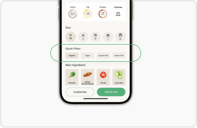
A/B Testing
Navigation Clarity
ResultOption B improved way-finding and reduced guesswork across the app.
Ingredient Information Visibility
ResultOption B improved discoverability by providing a clear interaction trigger and reducing hesitation during customisation.
Order Transparency in Cart
ResultOption B increased user confidence by clearly communicating what was included in the final order.
Deliver
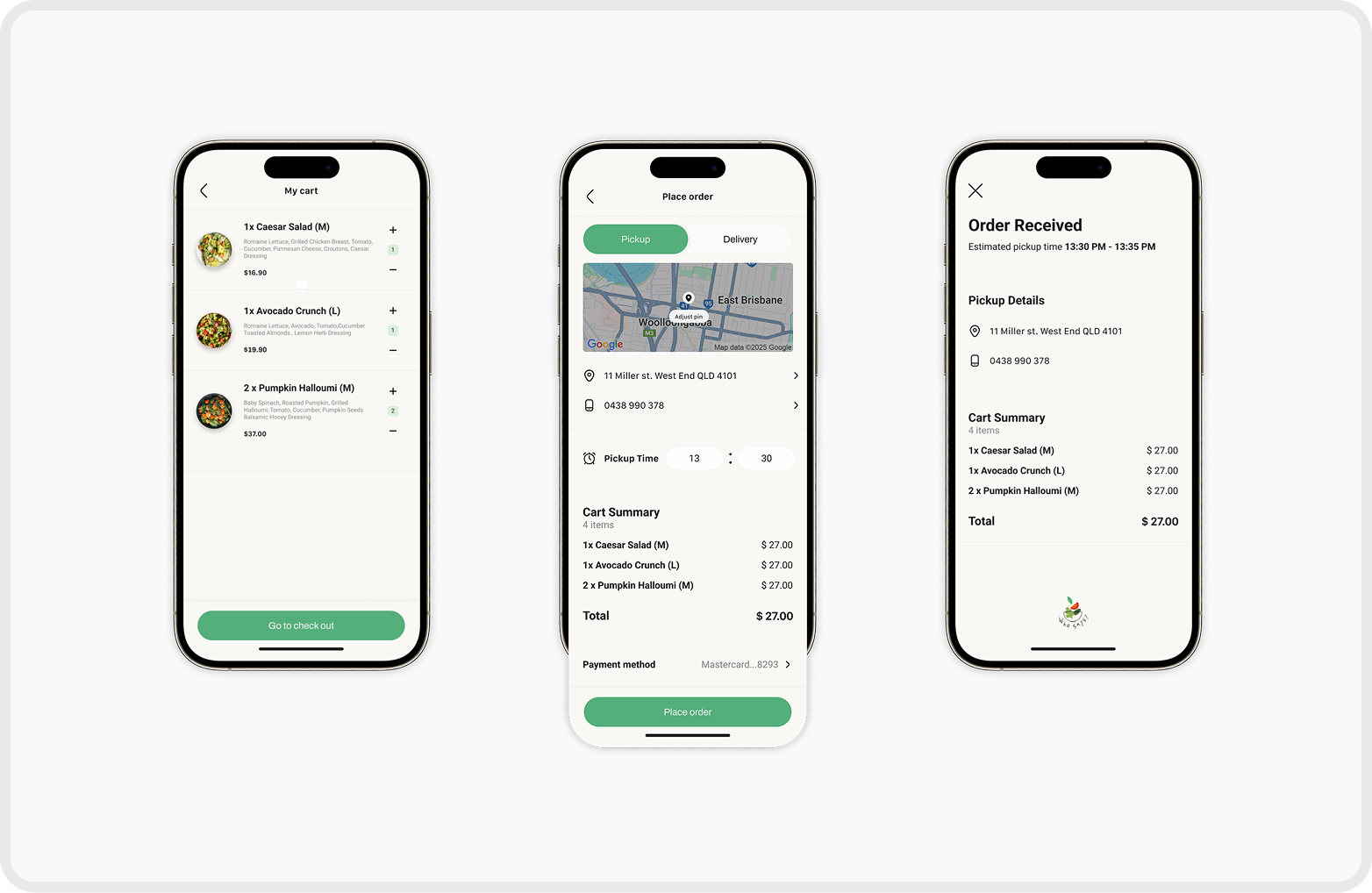
Final Prototype
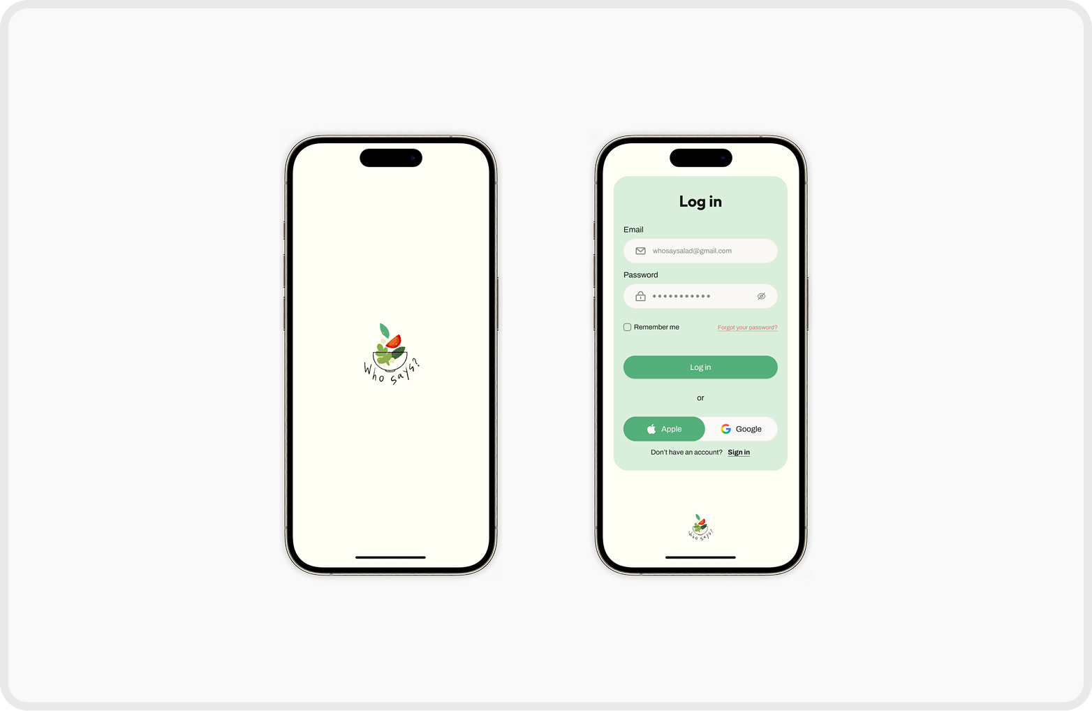
Start & Log In Page
Browse Page
Salads are organised into clear categories, allowing users to quickly find options that match their needs or dietary preferences.
Salad Detail Page
Macro nutrients, ingredients, and provenance are presented visually to build trust and support informed decision-making.
Customise Page
Users can adjust ingredients and portion sizes for greater flexibility.
Core ingredients remain fixed to preserve each bowl’s identity, while nutrients and pricing update dynamically with every change.
Customise Page
Users can adjust ingredients and portion sizes for greater flexibility.
Core ingredients remain fixed to preserve each bowl’s identity, while nutrients and pricing update dynamically with every change.
Deliver
Final Prototype
This prototype was created based on the user flow with key interactions rather than full functionality.
Deliver
Branding
Logo
The Who Says? logo features a salad bowl with vegetables falling into it, symbolising the app's inclusivity. The mix of ingredients represents the variety of tastes and preferences the platform caters to, highlighting its focus on customisation and diversity.
UI Design
Colour System
Font
Reflection
What I Learned
Minimal does not always mean clear.
Through A/B testing, I learned that reducing text and visual cues for the sake of minimalism can hurt clarity. Users perceived interfaces with clearer labels and explicit information as more supportive and trustworthy, even when the design was less visually minimal.
This reinforced that effective UX prioritises confidence and understanding over visual simplicity—especially in decision-heavy experiences.
What I would do differently
Designing with validation, not assumptions
I would invest more time in early market research and usability testing, even with rough wireframes. Validating assumptions sooner would enable faster iteration and more user-informed design decisions.
HOME
ABOUT
Who Says?
Who says you don’t make friends with salad?
A custom salad ordering app designed to accommodate diverse food restrictions and user expectations
Client & Industry
- Camila G.
- Food / Health / Lifestyle
Time Frame
1 Week
Aug 2025
Role
UX/UI Designer & Branding
Tools
Figma, Illustrator & Procreate
Overview
When healthy eating feels easier
What is Who Says?
Who Says? is a custom salad ordering app designed to help users build personalised salads based on their taste and dietary needs. Initiated by social entrepreneur Camila G., the concept reimagines healthy fast food as a simple and stress-free experience, supporting mindful eating through clear, intuitive customization without unnecessary complexity.
Background
When Customisation Creates Friction
Why this project matters
As dietary needs become more diverse, food-ordering experiences are expected to handle increasing complexity. However, many healthy food apps still introduce friction by failing to clearly communicate options and ingredient information.
This project focuses on addressing that gap by exploring how clarity and structure can improve decision-making in food customisation.
The Challenge
Balancing Personalisation with Clarity
Defining the problem to solve
Key Constraints
- Highly customisable food options
- Diverse dietary restrictions
- Fast and effortless ordering experience
The challenge was to translate complexity into clarity without compromising user control.
Design Process
Diamond Design Process
Discover
Users Needs & Insights
Insights
Based on the seven personas provided by the client, I mapped out their needs and translated them into actionable features for the app.
Discover
UI Pattern Exploration
Reviewing existing design approaches
An exploration of existing interfaces to understand how complex customisation, dietary information and ordering experience can be communicated clearly through UI patterns.
Define
Refined Problem Statement
What we need to solve
What we need to solve
Users with diverse dietary needs feel overwhelmed when customizing food due to unclear information and too many choices.
The Challenge
Design Goals
What success looks like
- Reduce decision fatigue during customisation
- Support confident and informed choices
- Maintain a fast ordering experience
Define
Feature Prioritization
What to build and WHY
Step-by-step bowl customisation
Reduces cognitive load by breaking decisions into manageable steps
Dietary indicators & filters
Helps users quickly assess suitability without scanning all ingredients
Guided ingredient selection
Balances freedom with structure
Develop
User Flow
Develop
Wireframe Sketch
Develop
Lo-Fi Prototype before A/B Testing
Develop
A/B Testing
Navigation Clarity
ResultOption B improved way-finding and reduced guesswork across the app.
Ingredient Information Visibility
ResultOption B improved discoverability by providing a clear interaction trigger and reducing hesitation during customisation.
Order Transparency in Cart
ResultOption B increased user confidence by clearly communicating what was included in the final order.
Deliver
Final Prototype
Start & Log In Page
Browse Page
Salads are organised into clear categories, allowing users to quickly find options that match their needs or dietary preferences.
Salad Detail Page
Macro nutrients, ingredients, and provenance are presented visually to build trust and support informed decision-making.
Customise Page
Users can adjust ingredients and portion sizes for greater flexibility.
Core ingredients remain fixed to preserve each bowl’s identity, while nutrients and pricing update dynamically with every change.
Customise Page
Users can adjust ingredients and portion sizes for greater flexibility.
Core ingredients remain fixed to preserve each bowl’s identity, while nutrients and pricing update dynamically with every change.
Deliver
Final Prototype
This prototype was created based on the user flow with key interactions rather than full functionality.
Deliver
Branding
Logo
The Who Says? logo features a salad bowl with vegetables falling into it, symbolising the app's inclusivity. The mix of ingredients represents the variety of tastes and preferences the platform caters to, highlighting its focus on customisation and diversity.
UI Design
Colour System
Font
Reflection
What I Learned
Minimal does not always mean clear.
Through A/B testing, I learned that reducing text and visual cues for the sake of minimalism can hurt clarity. Users perceived interfaces with clearer labels and explicit information as more supportive and trustworthy, even when the design was less visually minimal.
This reinforced that effective UX prioritises confidence and understanding over visual simplicity—especially in decision-heavy experiences.
What I would do differently
Designing with validation, not assumptions
I would invest more time in early market research and usability testing, even with rough wireframes. Validating assumptions sooner would enable faster iteration and more user-informed design decisions.
← Back
Overview
Design Process
Discover
Define
Develop
Deliver
Reflection