
Canetainers
Sustainable system for a circular future
A sugarcane-based takeaway packaging brand and mobile application that addresses circularity challenges
Role
UX/UI Designer (Team of 4
: 2 Communication Designers & 2 UX/UI Designers)
Time Frame
4 Weeks
Nov 2023
Tools
Figma, Illustrator, Photoshop, & Procreate
Client
QUT Class Project
Overview
Designing a Takeaway System That Doesn’t End at Disposal
What is Who Says?
Canetainers is a sugarcane-based takeaway packaging brand and mobile app that supports a circular recycling system. By linking sustainable packaging with a digital experience, the project encourages better recycling habits in everyday life.
Background
The Hidden Cost of Takeaway
Linear systems drive billions of single-use packaging decisions
Takeaway packaging largely follows a linear “take–make–waste” model.With billions of takeaway transactions each year, most packaging is used once and discarded, creating significant environmental waste.
Problem
Eco-friendly packaging fails to guide user behaviour
Sustainability without user participation
Sustainable materials alone do not ensure sustainable behaviour.Without clear guidance or motivation, users struggle to participate in circular recycling systems.
Design Goal
Designing a Circular Takeaway System
Linking biodegradable packaging with responsible recycling
To shift takeaway packaging from a linear model to a circular system by combining biodegradable materials with a mobile app that supports responsible recycling behaviour.
Design Process
Diamond Design Process
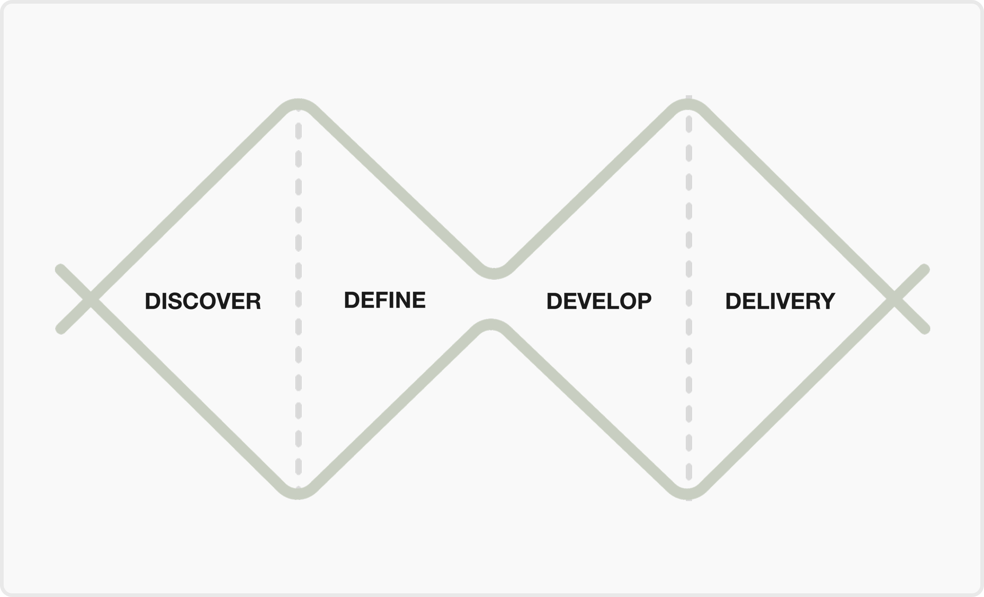
Discover
Understanding the Takeaway Packaging System
Define
Framing the Right Design Challenge
Develop
Solutions
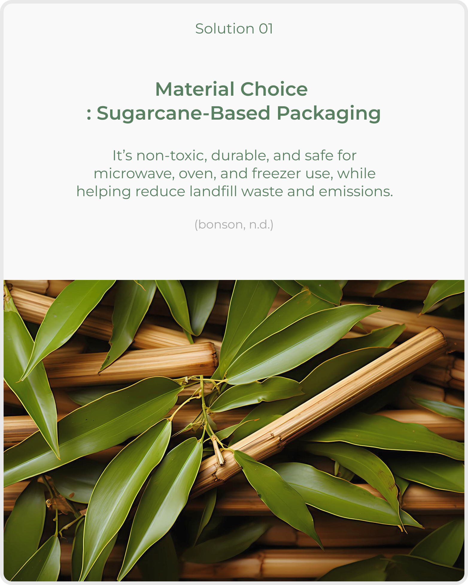
Develop
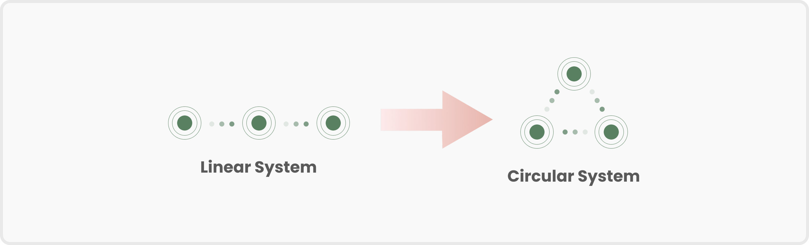
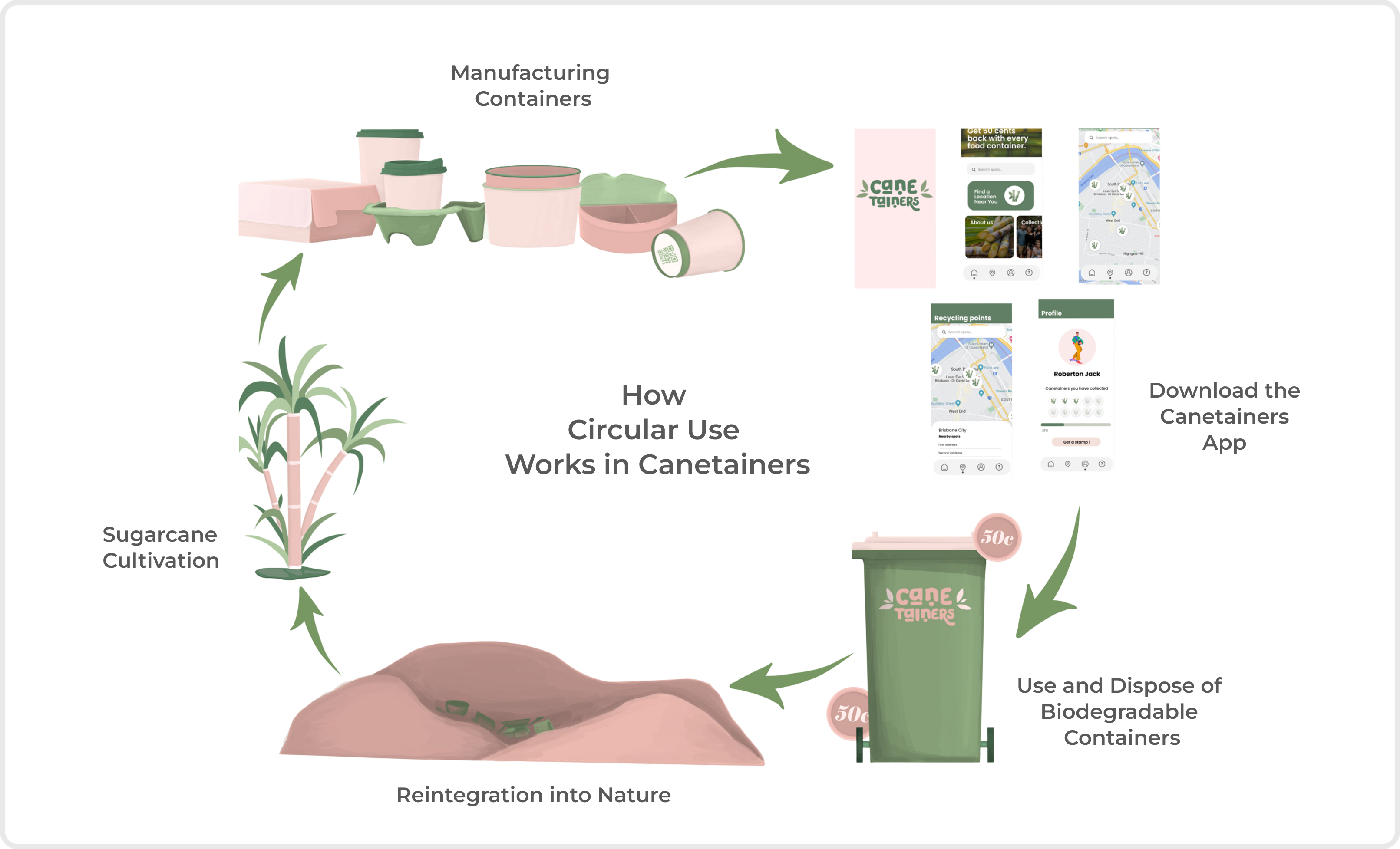
Circular Model in Canetiners
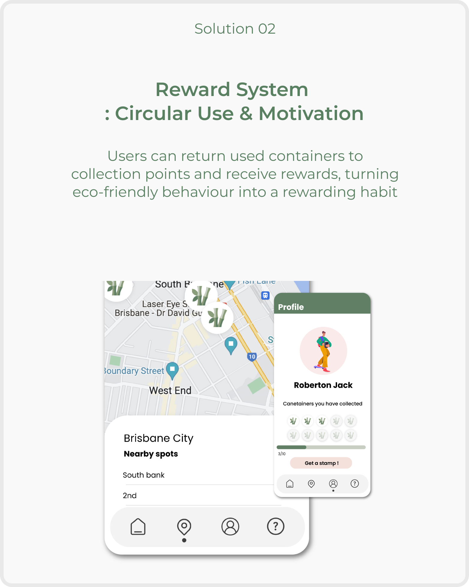
Develop
Feature Exploration
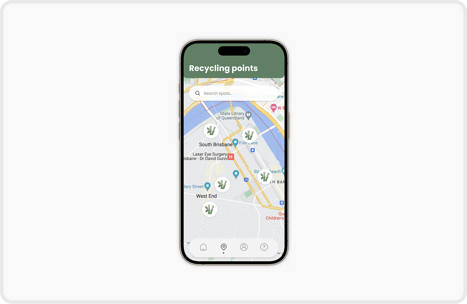
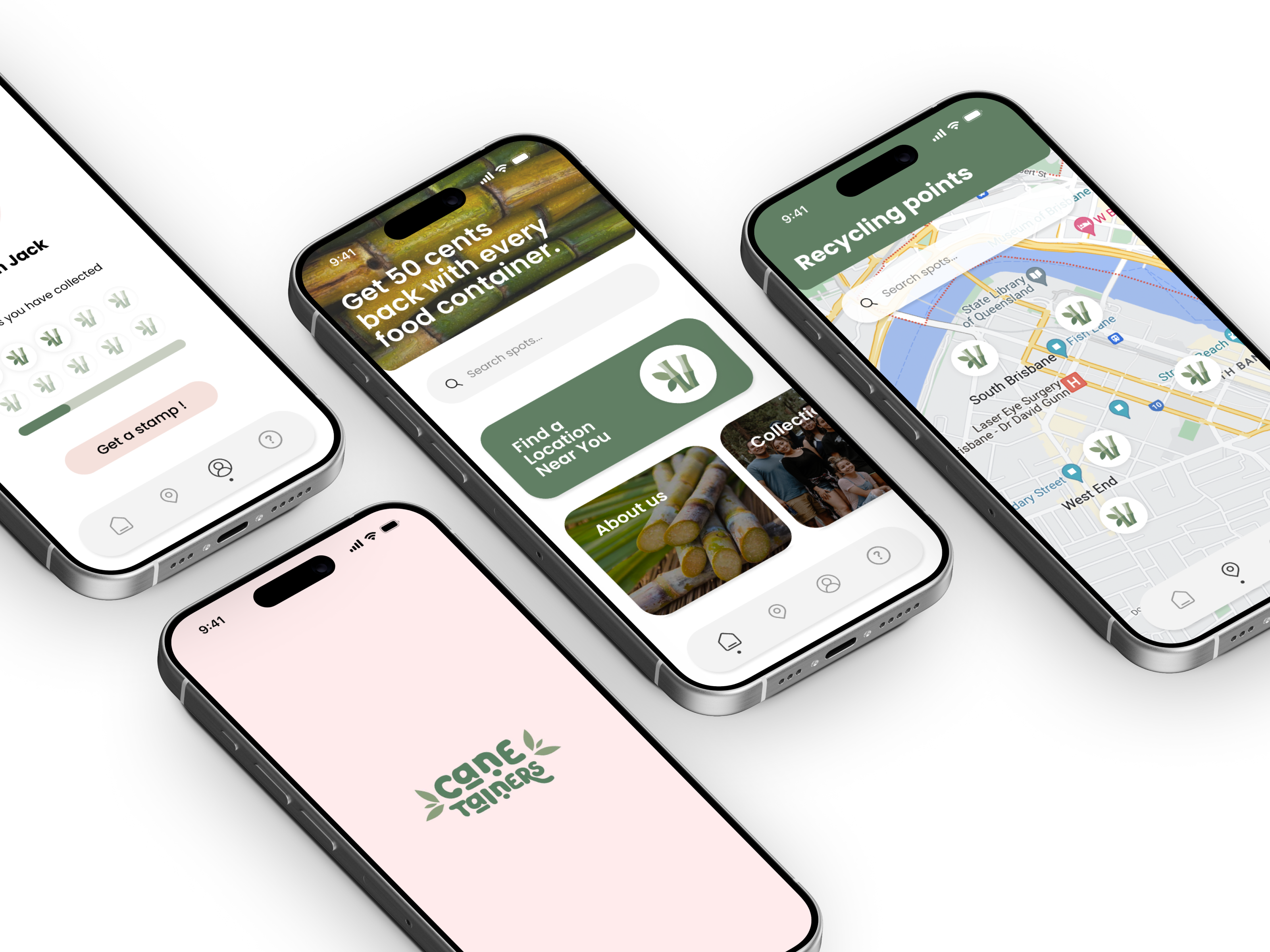
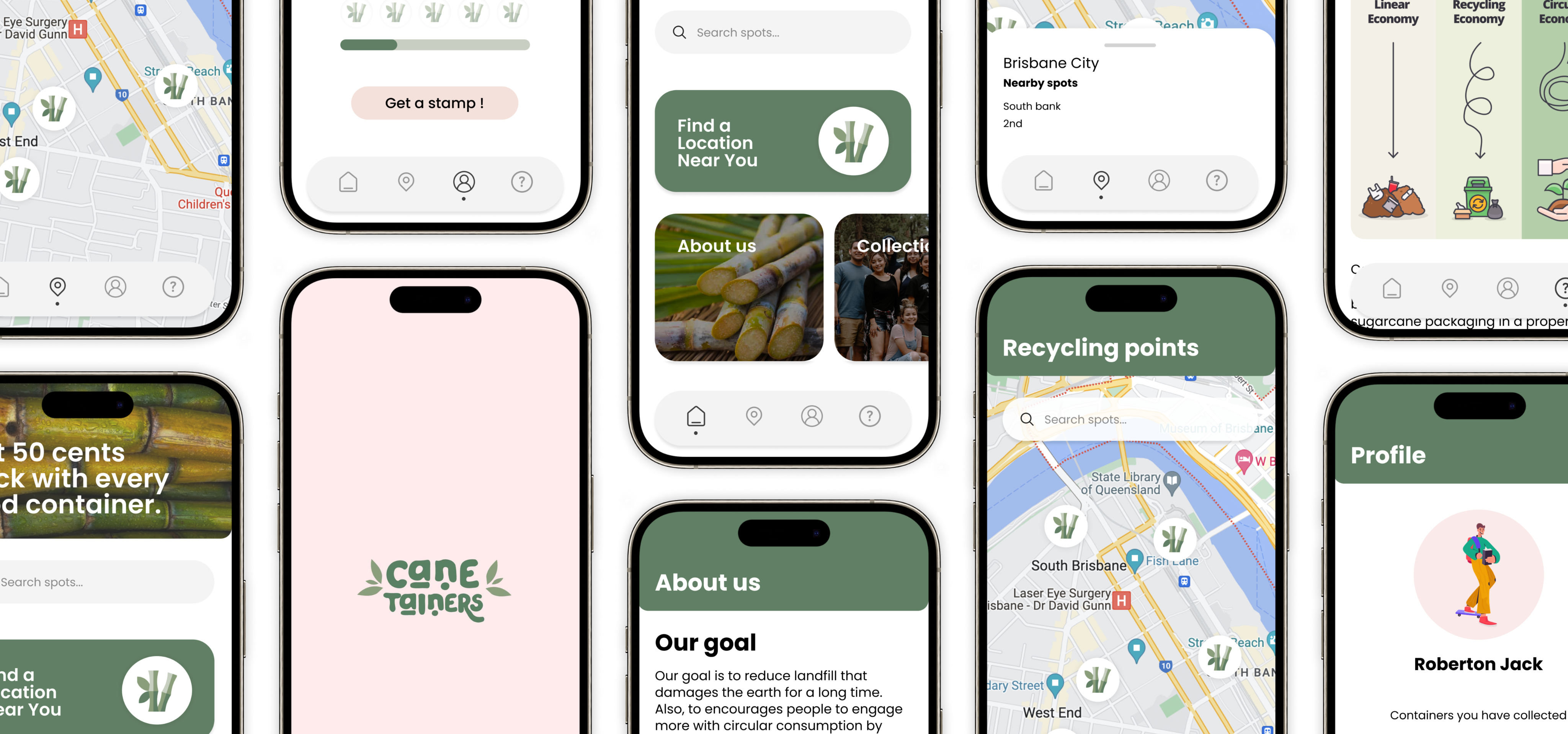
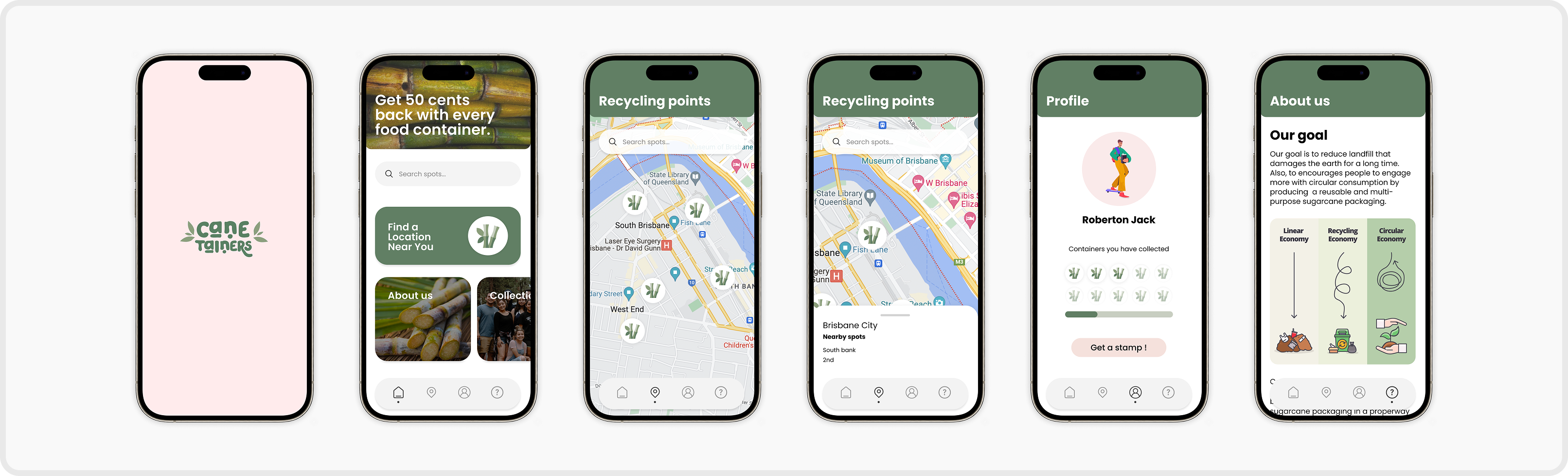
Map page for recycling points
The mobile app shows where and how to recycle Canetainers to ensure the consumers have the knowledge and will be more likely to commit.
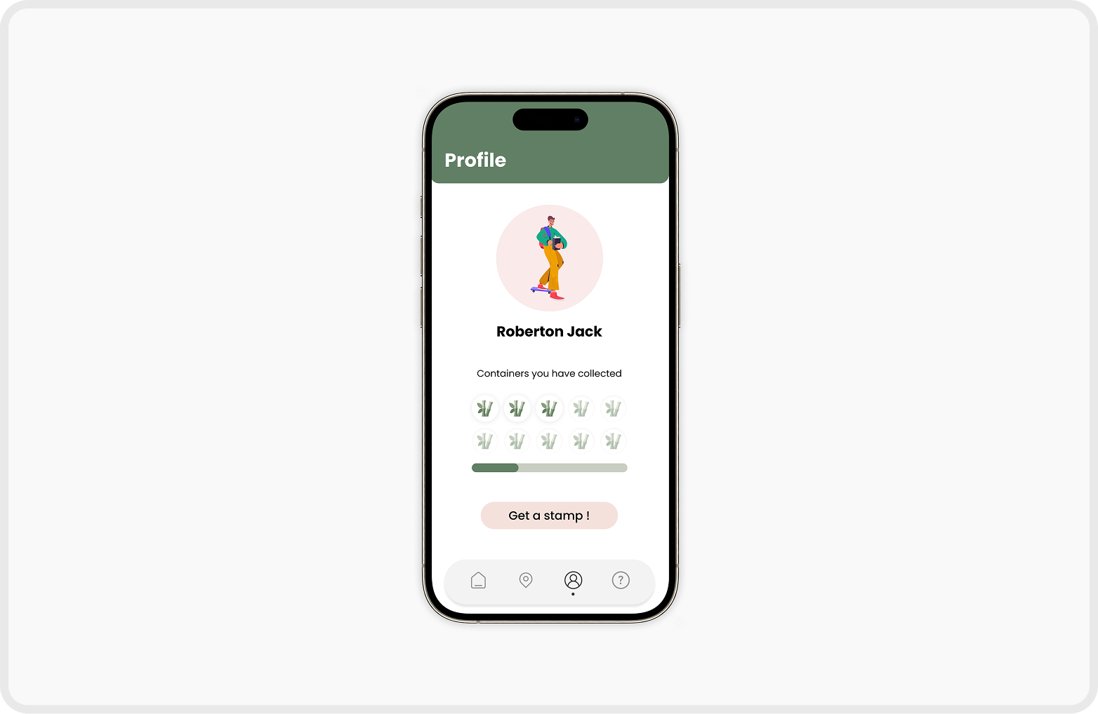
Reward system supports positive habit formation
We reward the users with incentives and positive feedback that they can see on their recycle counts in order to boost confidence and support positive habit formation of sustainable habits.
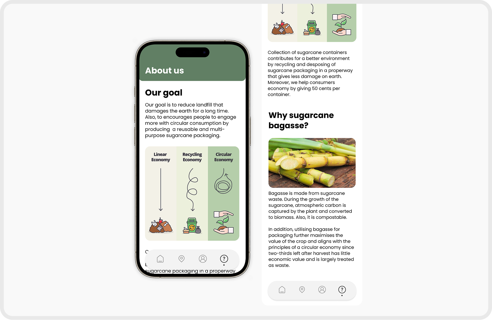
About us page shows the main goal of the Canetainer
The Canetainers app provides the information about the background of the brand which can enhance user’s understanding of the goal of Canetainer.
Deliver
Branding
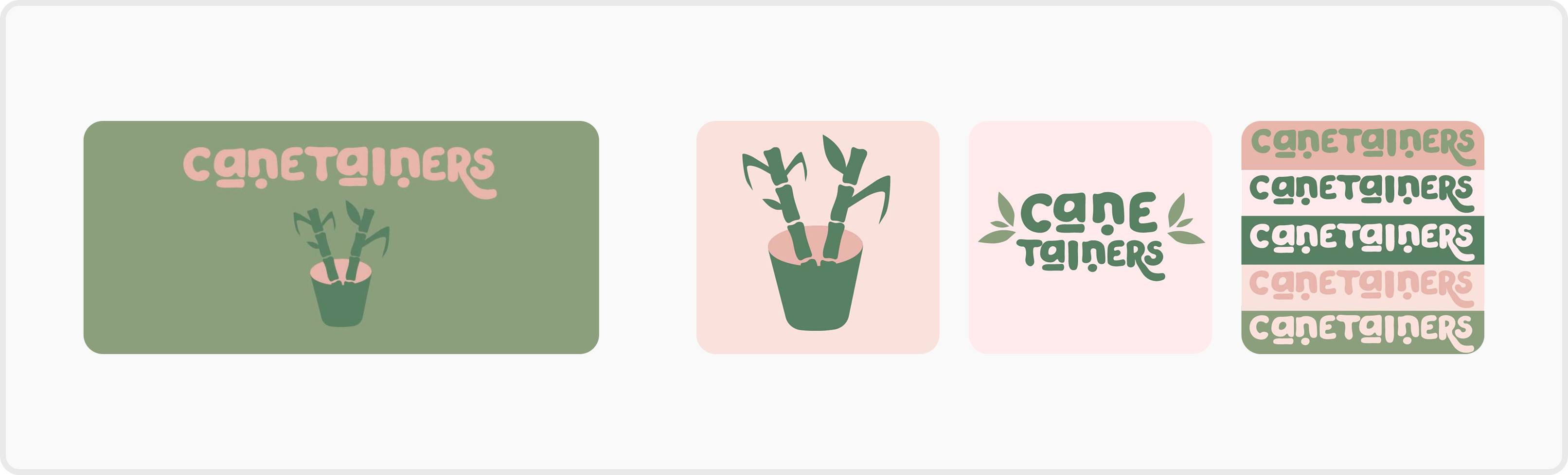
Logo
Designed with minimal shapes and a pastel colour palette, the icon aims to be both simple and elegant, reflecting the product’s natural and sustainable qualities.
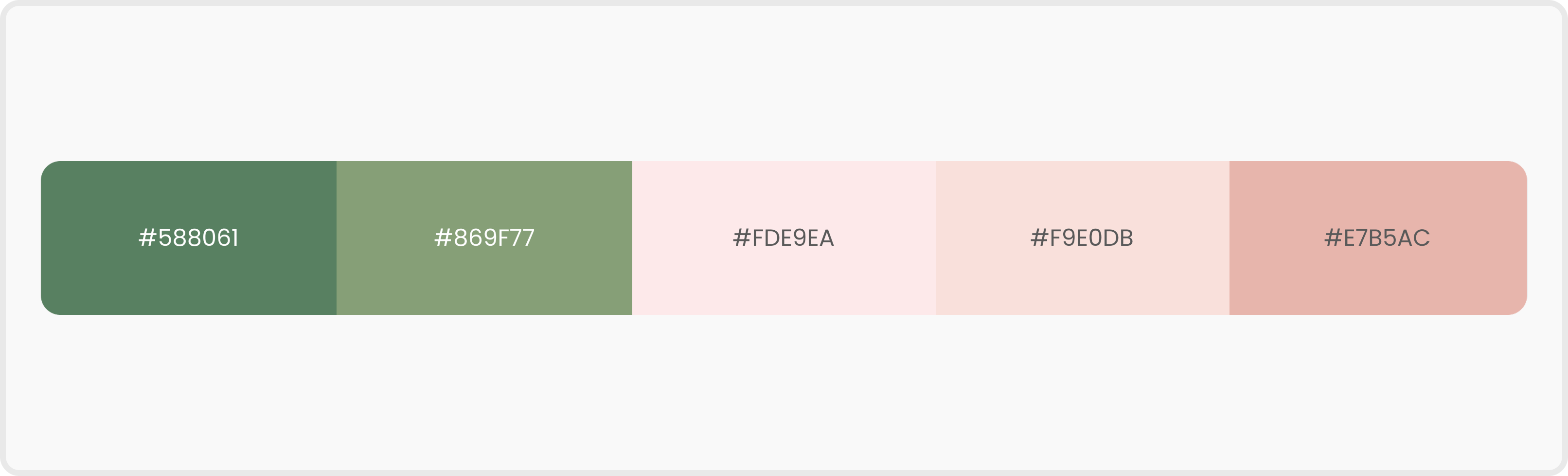
Colours
Pastel colours were chosen to convey a sense of calmness, purity, and approachability aligning with the eco-friendly and health-conscious values of the brand.
Deliver
UI Design
UI Prototype Design
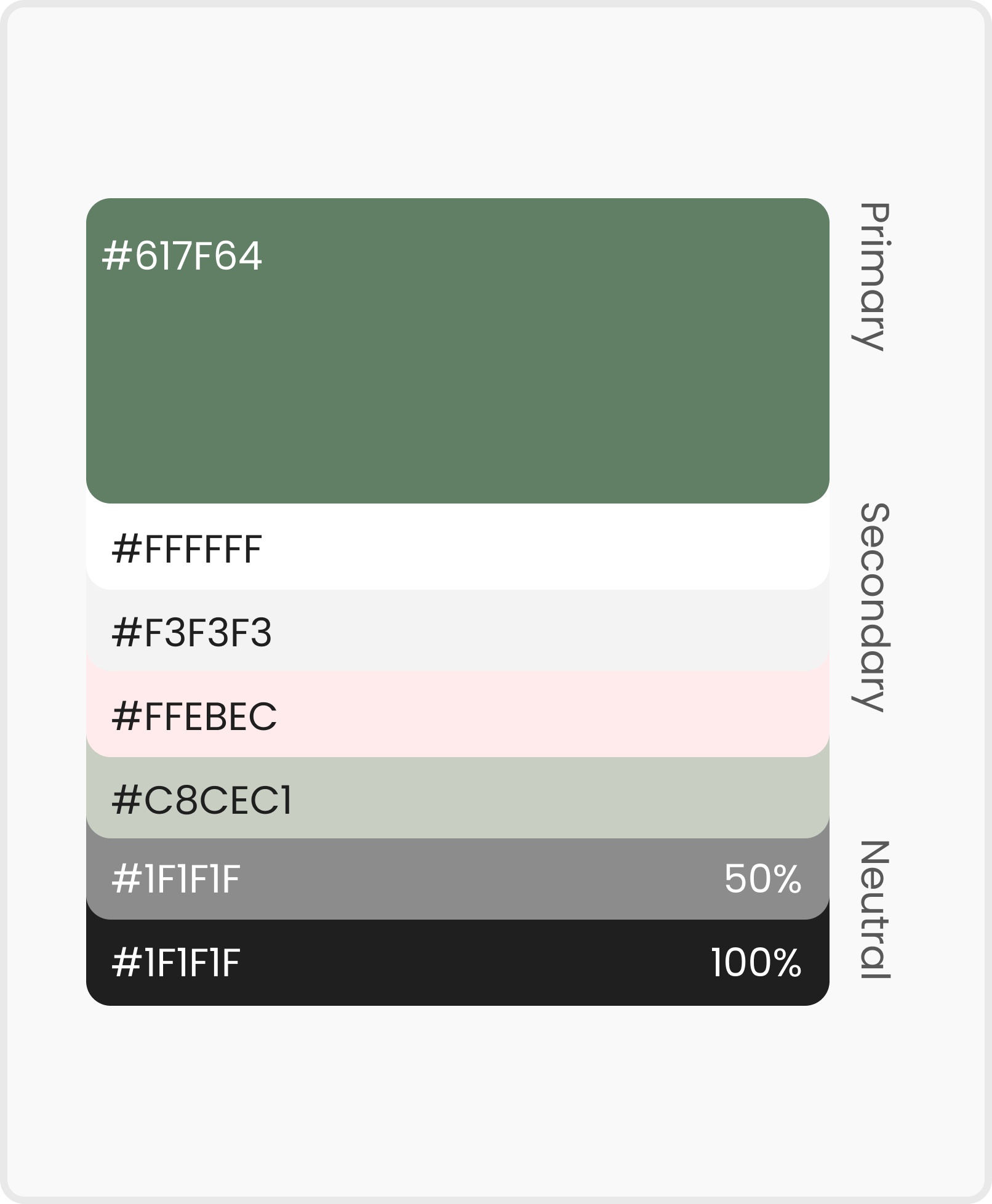
Colour System
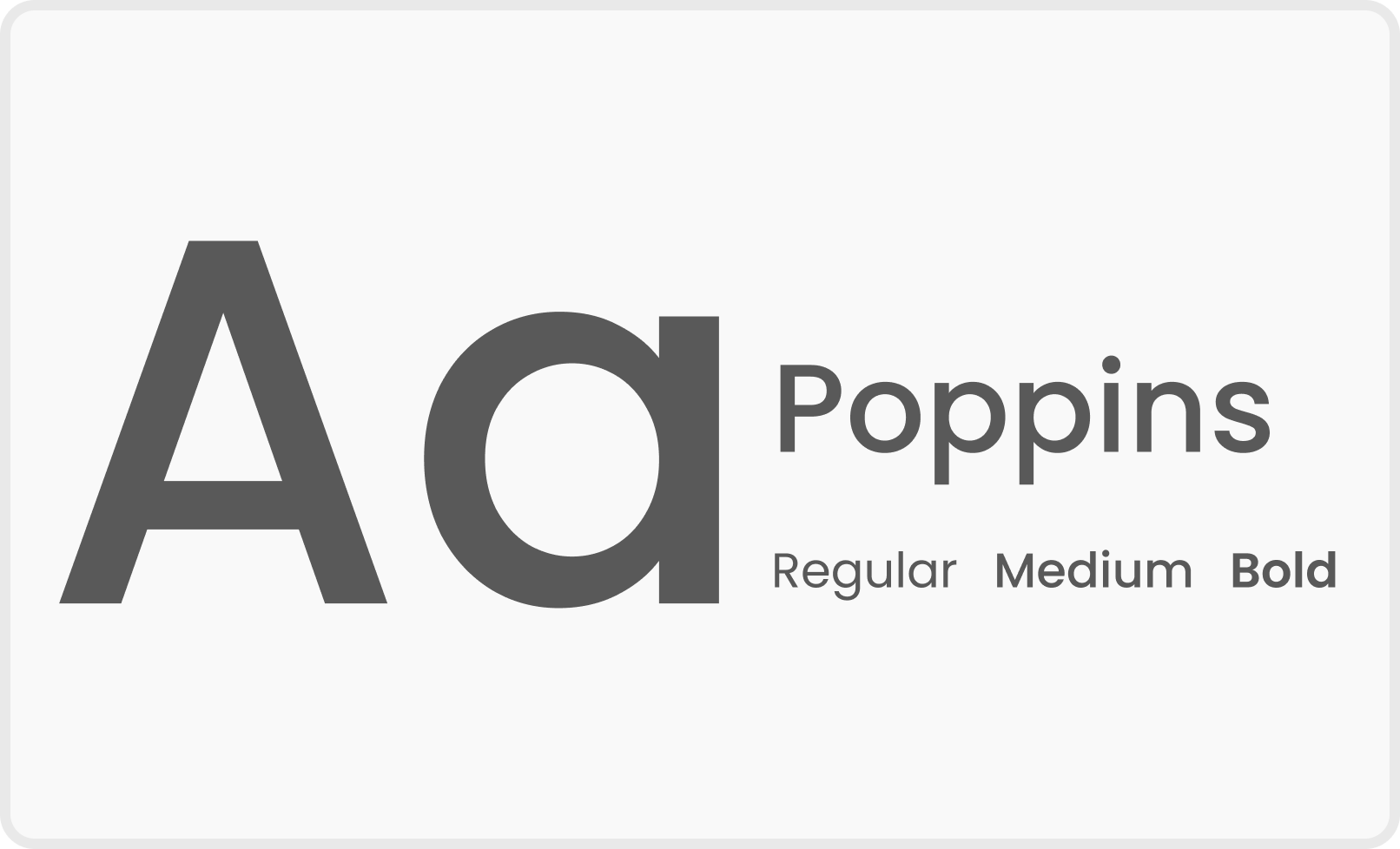
Font
Reflection
What I Learned
Sustainability Requires System Thinking
This project highlighted that sustainable design extends beyond materials and must be approached as a system. Aligning user behaviour, production constraints, and environmental impact was essential to creating a meaningful circular experience.
What I would do differently
Testing and Collaboration Earlier
If revisiting this project, I would involve production stakeholders earlier and test behaviour-driven interactions sooner to better evaluate feasibility and real-world impact.
Deliver
Final Prototype
© 2026 Jezz Hong. All rights reserved.
HOME
ABOUT
Canetainers
Sustainable system for a circular future
A sugarcane-based takeaway packaging brand and mobile application that addresses circularity challenges
Role
UX/UI Designer (Team of 4
: 2 Communication Designers & 2 UX/UI Designers)
Time Frame
4 Weeks
Nov 2023
Tools
Figma, Illustrator, Photoshop, & Procreate
Client
QUT Class Project
Overview
Designing a Takeaway System That Doesn’t End at Disposal
What is Who Says?
Canetainers is a sugarcane-based takeaway packaging brand and mobile app that supports a circular recycling system. By linking sustainable packaging with a digital experience, the project encourages better recycling habits in everyday life.
Background
The Hidden Cost of Takeaway
Linear systems drive billions of single-use packaging decisions
Takeaway packaging largely follows a linear “take–make–waste” model.With billions of takeaway transactions each year, most packaging is used once and discarded, creating significant environmental waste.

Problem
Eco-friendly packaging fails to guide user behaviour
Sustainability without user participation
Sustainable materials alone do not ensure sustainable behaviour.Without clear guidance or motivation, users struggle to participate in circular recycling systems.
Design Goal
Designing a Circular Takeaway System
Linking biodegradable packaging with responsible recycling
To shift takeaway packaging from a linear model to a circular system by combining biodegradable materials with a mobile app that supports responsible recycling behaviour.
Design Process
Diamond Design Process
Discover
Understanding the Takeaway Packaging System
Define
Framing the Right Design Challenge
Develop
Solutions
Develop
Circular Model in Canetiners
Develop
Feature Exploration
Map page for recycling points
The mobile app shows where and how to recycle Canetainers to ensure the consumers have the knowledge and will be more likely to commit.
Reward system supports positive habit formation
We reward the users with incentives and positive feedback that they can see on their recycle counts in order to boost confidence and support positive habit formation of sustainable habits.
About us page shows the main goal of the Canetainer
The Canetainers app provides the information about the background of the brand which can enhance user’s understanding of the goal of Canetainer.
Deliver
Branding
Logo
Designed with minimal shapes and a pastel colour palette, the icon aims to be both simple and elegant, reflecting the product’s natural and sustainable qualities.
Colours
Pastel colours were chosen to convey a sense of calmness, purity, and approachability aligning with the eco-friendly and health-conscious values of the brand.
Deliver
UI Design
UI Prototype Design
Colour System
Font
Reflection
What I Learned
Sustainability Requires System Thinking
This project highlighted that sustainable design extends beyond materials and must be approached as a system. Aligning user behaviour, production constraints, and environmental impact was essential to creating a meaningful circular experience.
What I would do differently
Testing and Collaboration Earlier
If revisiting this project, I would involve production stakeholders earlier and test behaviour-driven interactions sooner to better evaluate feasibility and real-world impact.
Deliver
Final Prototype
© 2026 Jezz Hong. All rights reserved.
HOME
ABOUT
Canetainers
Sustainable system for a circular future
A sugarcane-based takeaway packaging brand and mobile application that addresses circularity challenges
Role
UX/UI Designer (Team of 4
: 2 Communication Designers & 2 UX/UI Designers)
Time Frame
4 Weeks
Nov 2023
Tools
Figma, Illustrator, Photoshop, & Procreate
Client
QUT Class Project
Overview
Designing a Takeaway System That Doesn’t End at Disposal
A circular takeaway system connecting packaging and recycling
Canetainers is a sugarcane-based takeaway packaging brand and mobile app that supports a circular recycling system. By linking sustainable packaging with a digital experience, the project encourages better recycling habits in everyday life.
Background
The Hidden Cost of Takeaway
Linear systems drive billions of single-use packaging decisions
Takeaway packaging largely follows a linear “take–make–waste” model.With billions of takeaway transactions each year, most packaging is used once and discarded, creating significant environmental waste.
Problem
Eco-friendly packaging fails to guide user behaviour
Sustainability without user participation
Sustainable materials alone do not ensure sustainable behaviour.Without clear guidance or motivation, users struggle to participate in circular recycling systems.
Design Goal
Designing a Circular Takeaway System
Linking biodegradable packaging with responsible recycling
To shift takeaway packaging from a linear model to a circular system by combining biodegradable materials with a mobile app that supports responsible recycling behaviour.
Design Process
Diamond Design Process
Discover
Understanding the Takeaway Packaging System
Define
Framing the Right Design Challenge
Develop
Solutions
Develop
Circular Model in Canetiners
Develop
Feature Exploration
Map page for recycling points
The mobile app shows where and how to recycle Canetainers to ensure the consumers have the knowledge and will be more likely to commit.
Reward system supports positive habit formation
We reward the users with incentives and positive feedback that they can see on their recycle counts in order to boost confidence and support positive habit formation of sustainable habits.
About us page shows the main goal of the Canetainer
The Canetainers app provides the information about the background of the brand which can enhance user’s understanding of the goal of Canetainer.
Deliver
Branding
Logo
Designed with minimal shapes and a pastel colour palette, the icon aims to be both simple and elegant, reflecting the product’s natural and sustainable qualities.
Colours
Pastel colours were chosen to convey a sense of calmness, purity, and approachability aligning with the eco-friendly and health-conscious values of the brand.
Deliver
UI Design
UI Prototype Design
Colour System
Font
Deliver
Final Prototype
Reflection
What I Learned
Sustainability Requires System Thinking
This project highlighted that sustainable design extends beyond materials and must be approached as a system. Aligning user behaviour, production constraints, and environmental impact was essential to creating a meaningful circular experience.
What I would do differently
Testing and Collaboration Earlier
If revisiting this project, I would involve production stakeholders earlier and test behaviour-driven interactions sooner to better evaluate feasibility and real-world impact.
← Back
Overview
Design Process
Discover
Define
Develop
Deliver
Reflection
© 2026 Jezz Hong. All rights reserved.