IN-HOUSE DESIGN PROJECT
App Renewal &
Launching Project
Redesigning a multilingual training app to make quality learning more consistent, engaging, and user-friendly
My Role
UX/UI Redesign 50% & Rebranding 100%
Tools
Figma Power Apps & Photoshop
Time Frame
4 Months (part-time alongside other projects)
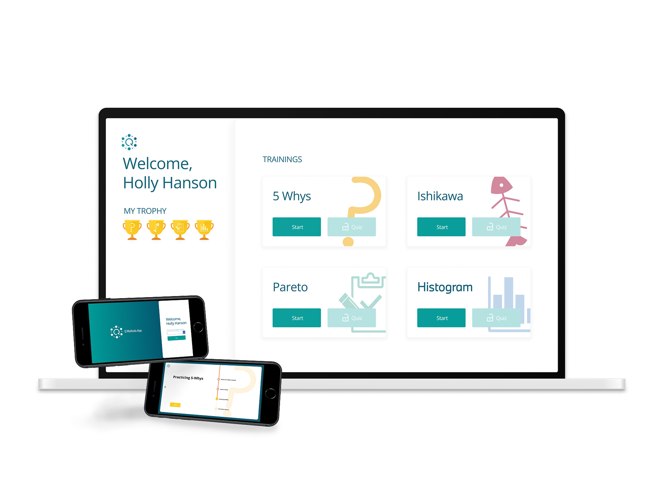
Currently optimised for desktop
Mobile version coming soon
PROJECT SUMMARY
The Q Methods App is a multilingual training application (80+ pages) developed to enhance BMW employees’ understanding of quality management methods.
However, the existing app lacked visual consistency and presented an overwhelming amount of disorganised information, making it difficult for users to absorb content effectively. Through collaboration with the project lead, we addressed these issues by rebranding the app to be more cohesive and user-friendly.
The renewal design focuses on creating a playful yet professional experience one that feels engaging without appearing childish, as specifically requested by the project lead.
IDENTIFY PROBLEMS & PROJECT GOALS
Simplify Logo
and Build
a Design System
01
Unclear Brand Identity
Standardise
Layout, Typography,
and Icons
02
Inconsistent UI Elements
Improve
through
Visual Hierarchy
03
Overloaded Interface
01. Simplify Logo and Build a Design System
01. Simplify Logo and Build a Design System
Rebranding
before
after

Logo Redesign
I retained the original shape and incorporated the letter ‘Q’ to represent the project’s identity, creating a simple and modern logo for the Q Methods App.





variations
Colour System
point colours
Font
Open Sans
48px
Bold
Bold, Regular
36px
Bold, Regular
24px
Bold, Regular
20px
Regular
14px
components and icons in #7B7B7B inside the gray border are replaces with the point colours of each training section
Component




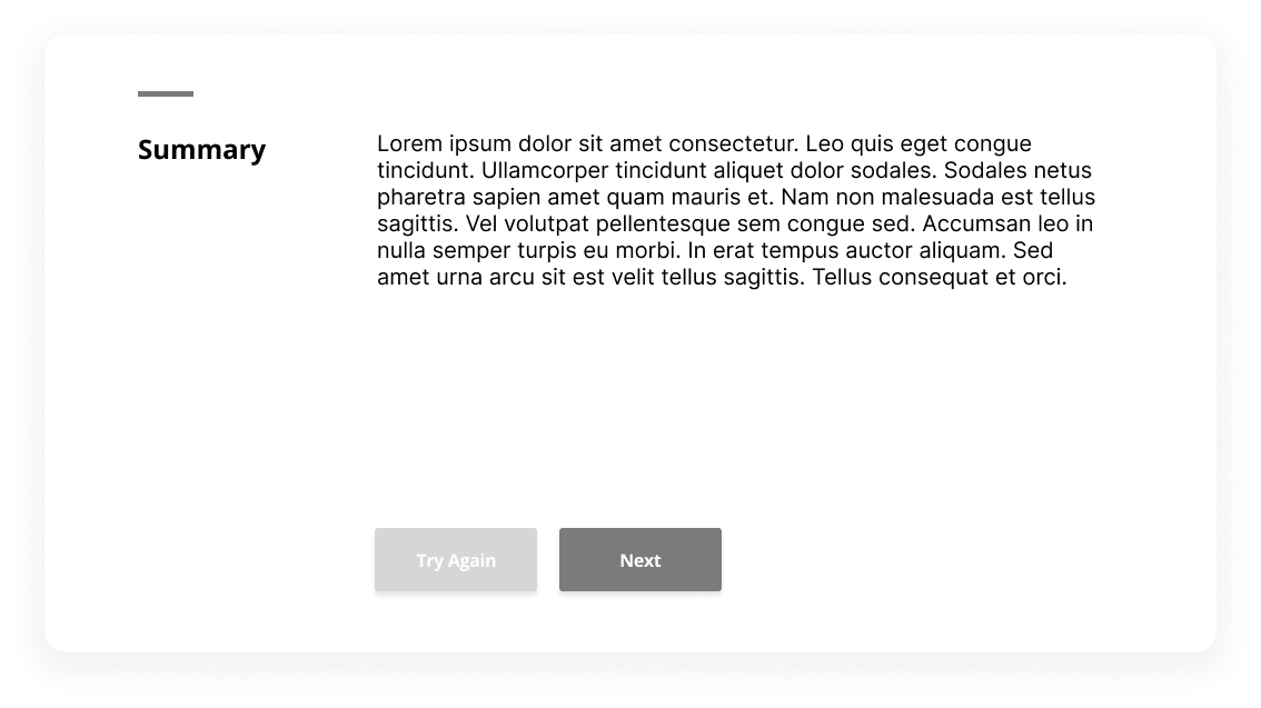


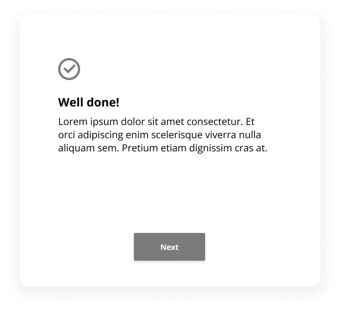
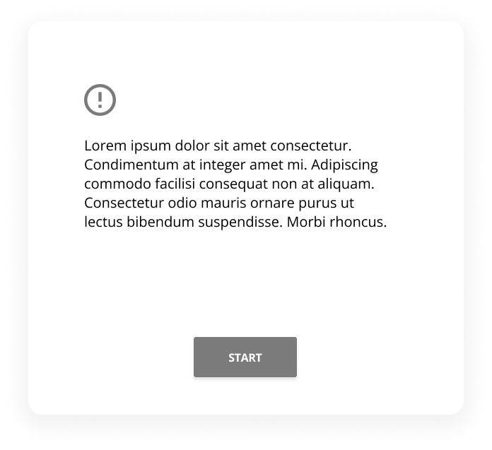
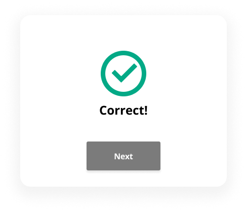
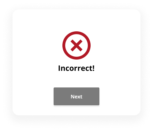
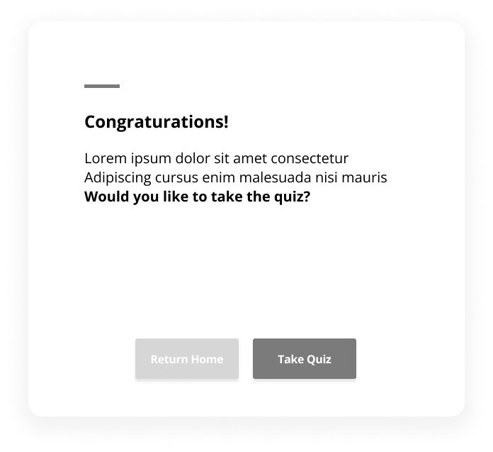
Icons
1
2
02. Standardise Layout, Typography and Icons
03. Improve through Visual Hierarchy
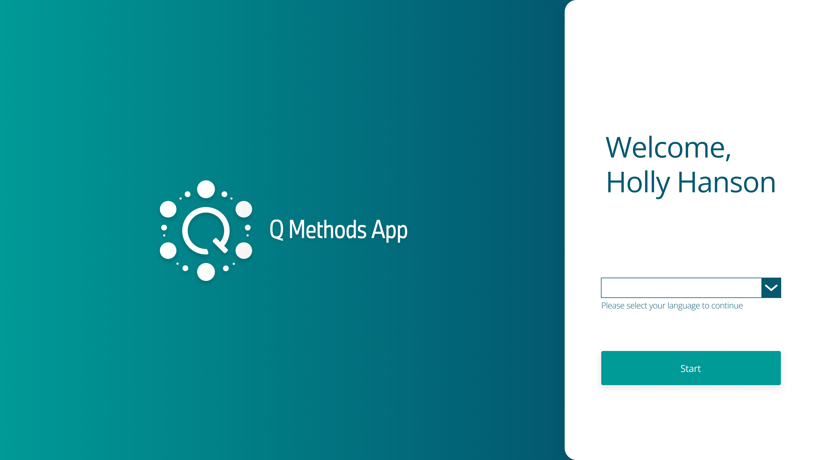
Balanced Visual Hierarchy

before
- Reduced the logo size to balance the overall layout
- Enlarged the "Start" button to enhance visibility and encourage user interaction
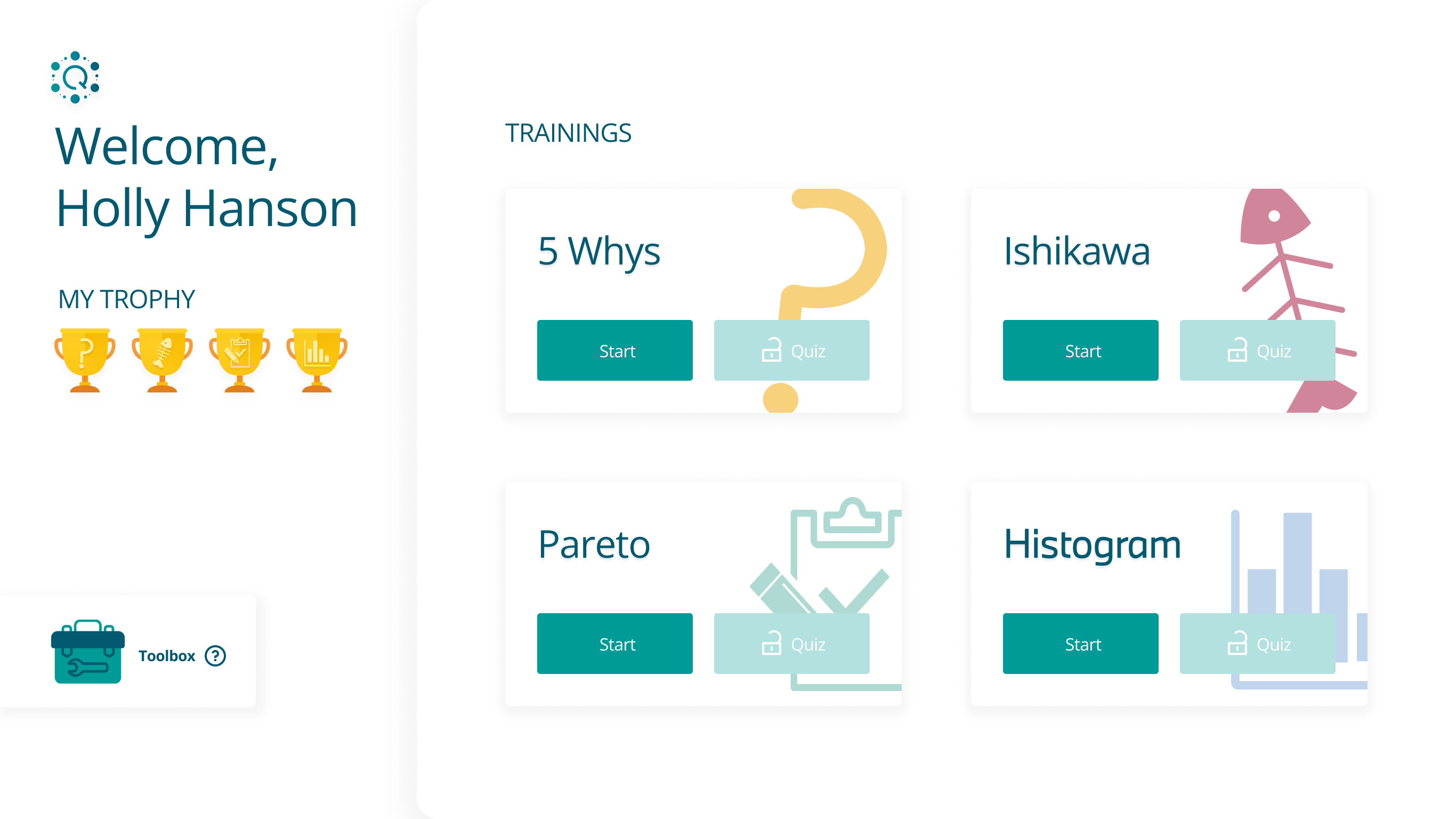
Clear Seperation for Better Focus
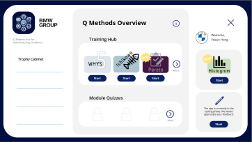
before
- Improved user focus by clearly separating the profile section from the training list
- Added unique icons to each training to help users quickly identify and differentiate content
Structured Navigation with
Progress Feedback
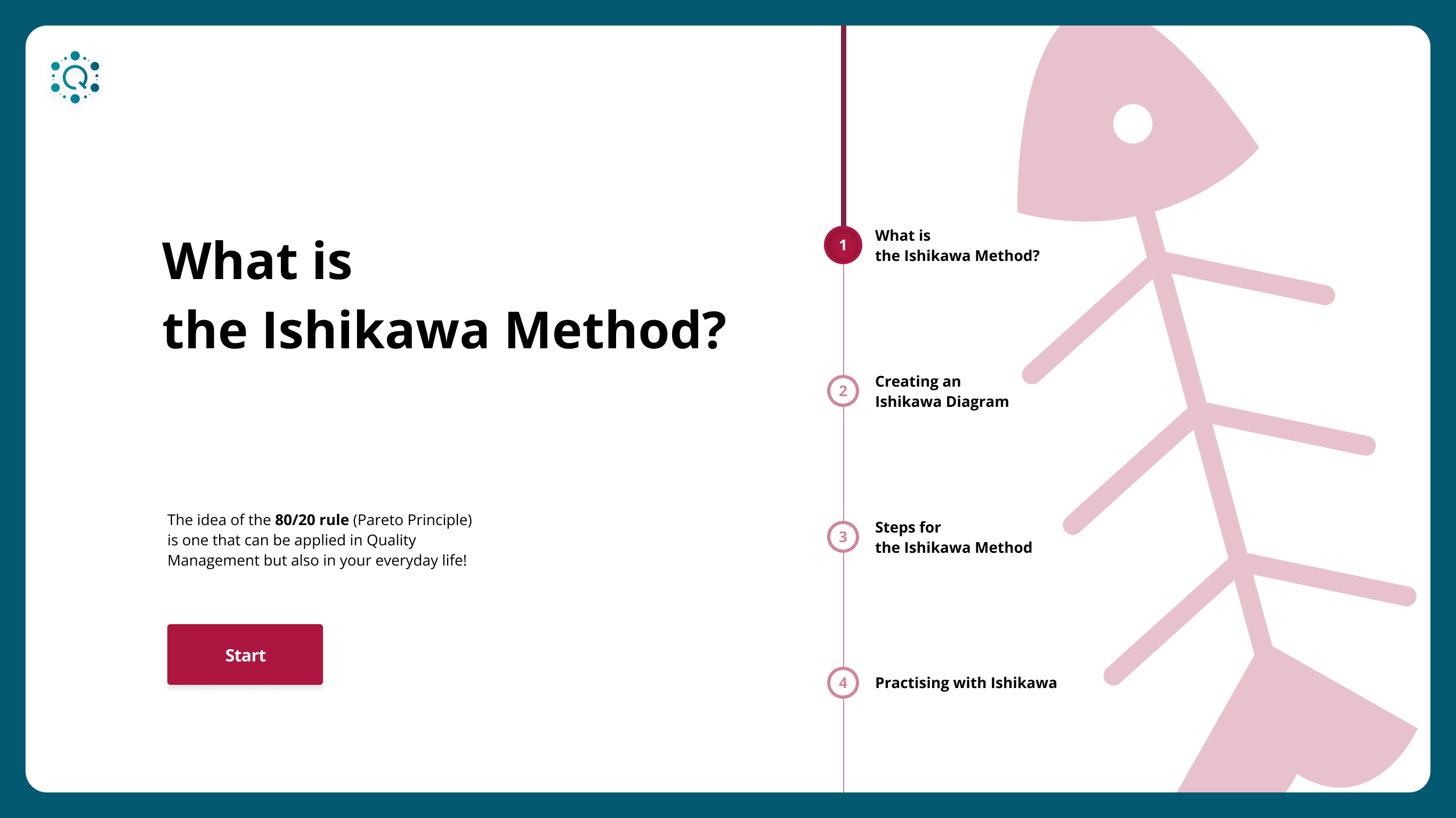
- Introduced chapter overview pages for better context and smoother navigation
- Added a progress bar to each chapter page to visually communicate learning progress
Clear and Interactive Quiz Layout
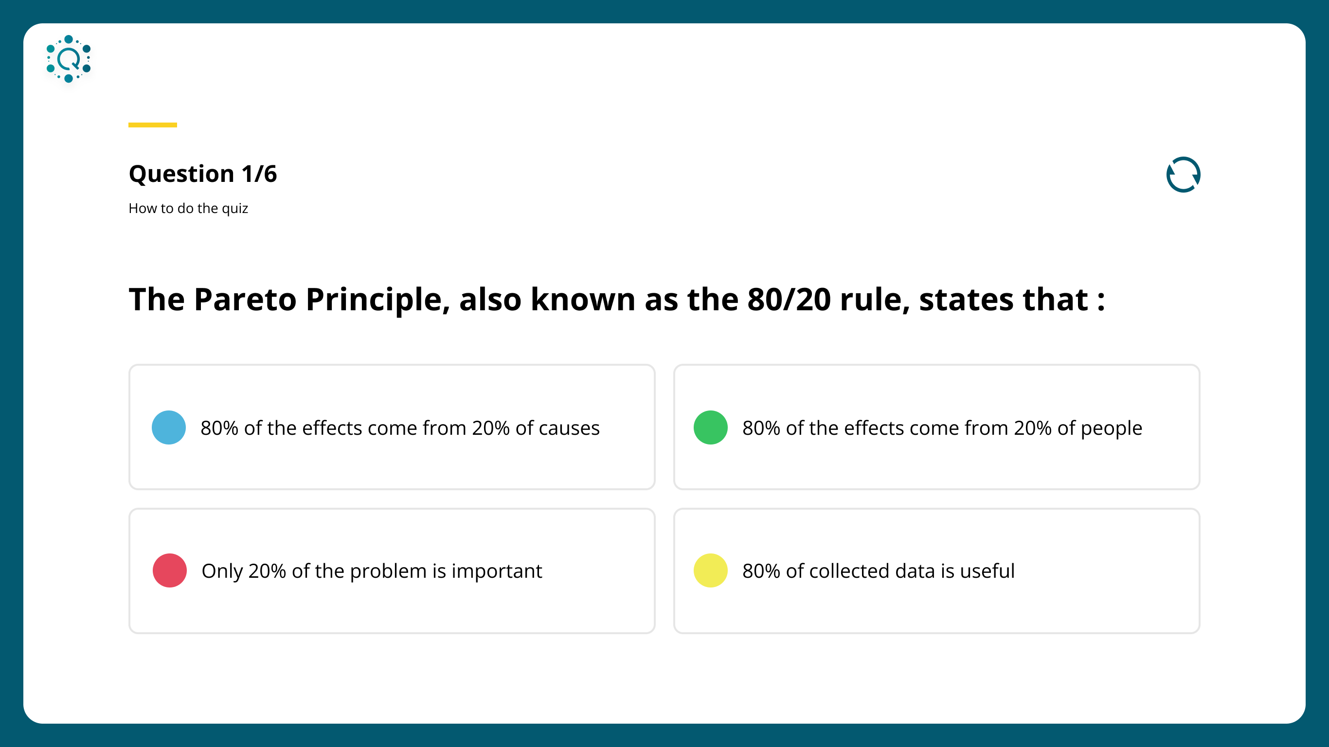
- Included progression text (e.g. "Question 2/5") to inform users of their current position in the quiz
- Applied different colours to each multiple-choice option to enhance visual separation and reduce cognitive load
- Added color-changing icons next to each training title to indicate the current selection
- Used the brand’s green background to reinforce identity
- Applied accent colours to distinguish each training and improve visual consistency
Visually Guided Contents Page
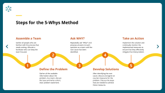
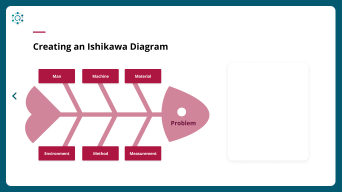
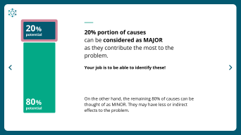
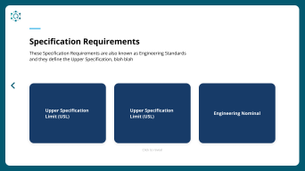
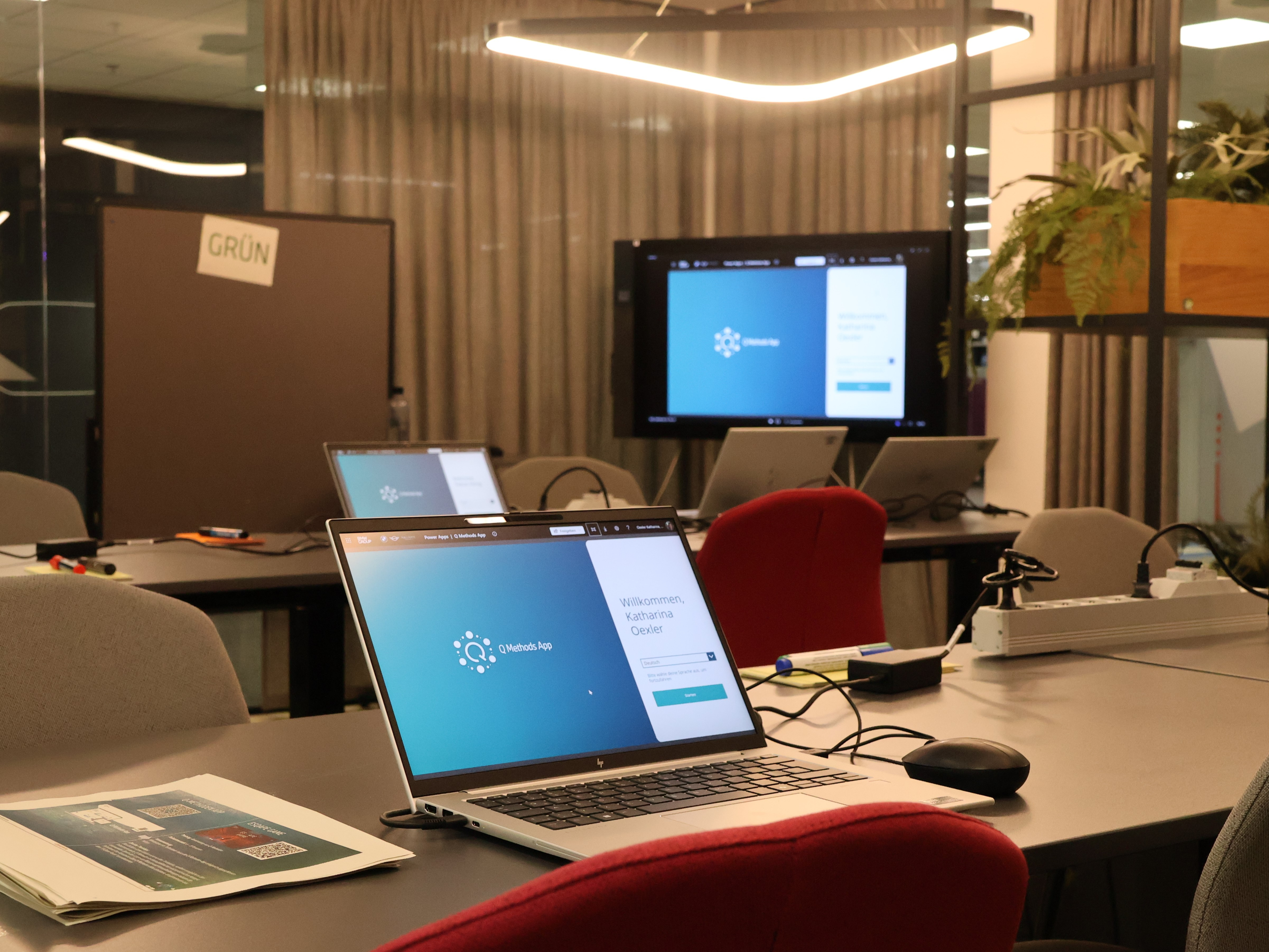
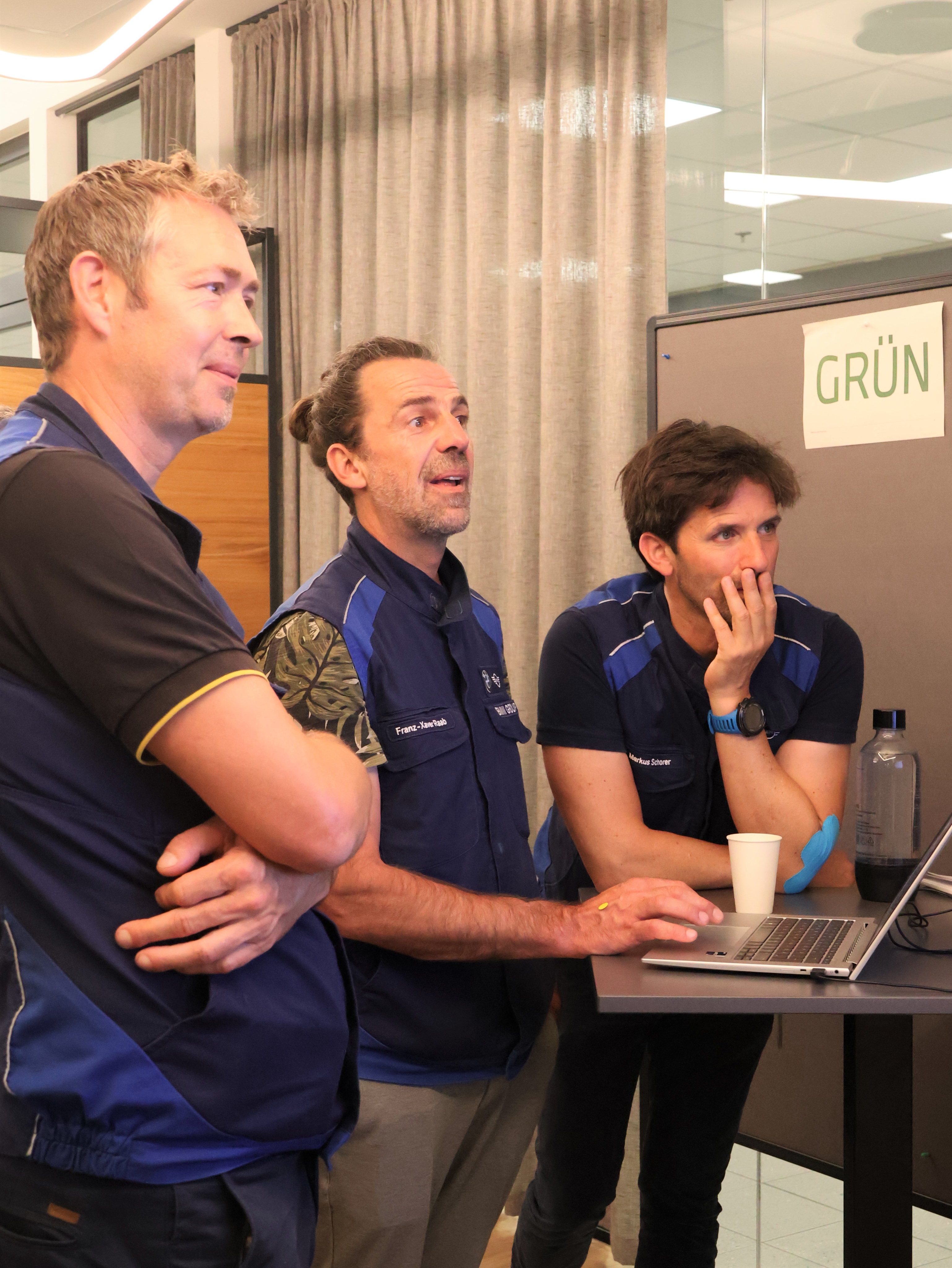
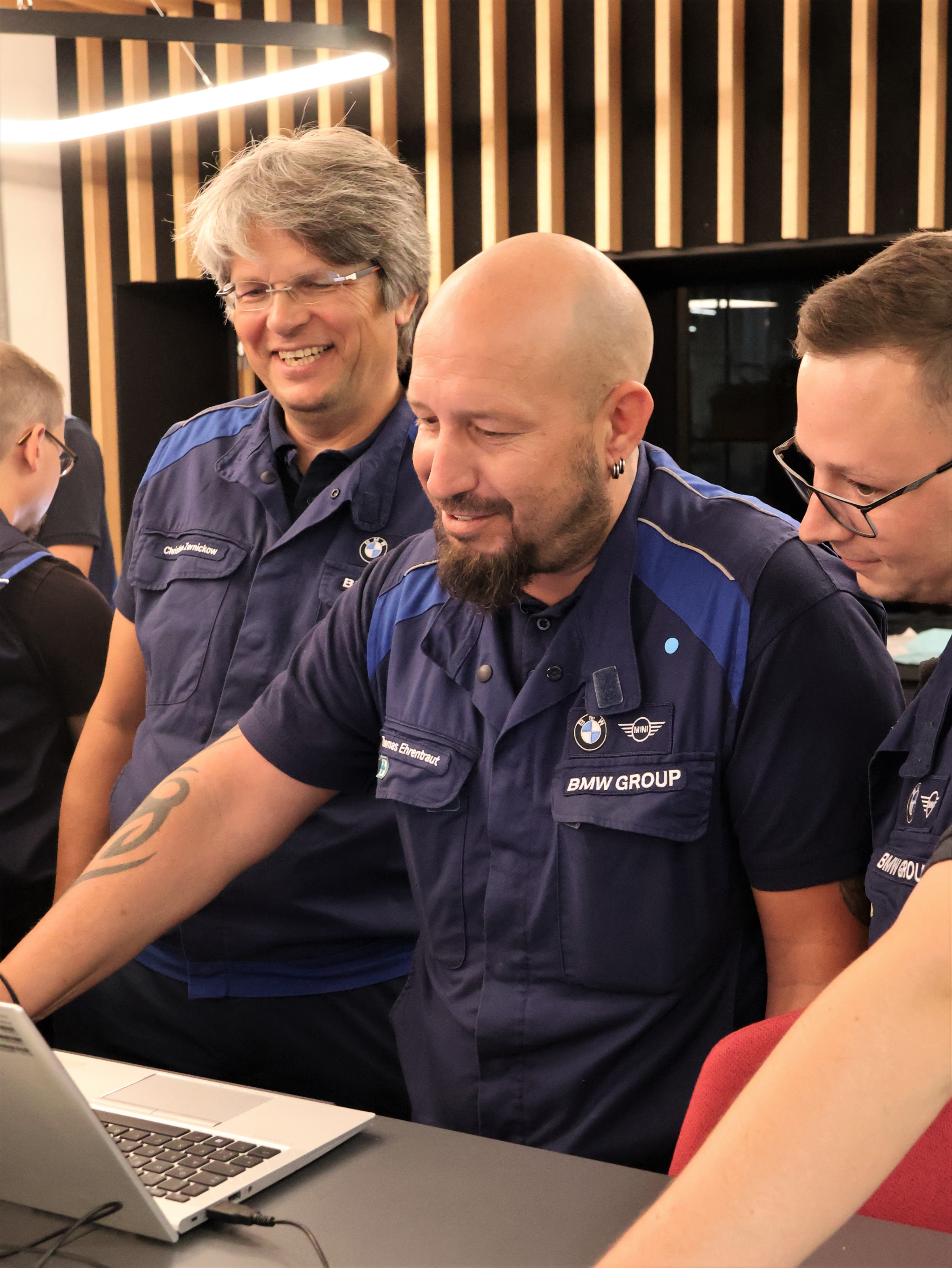
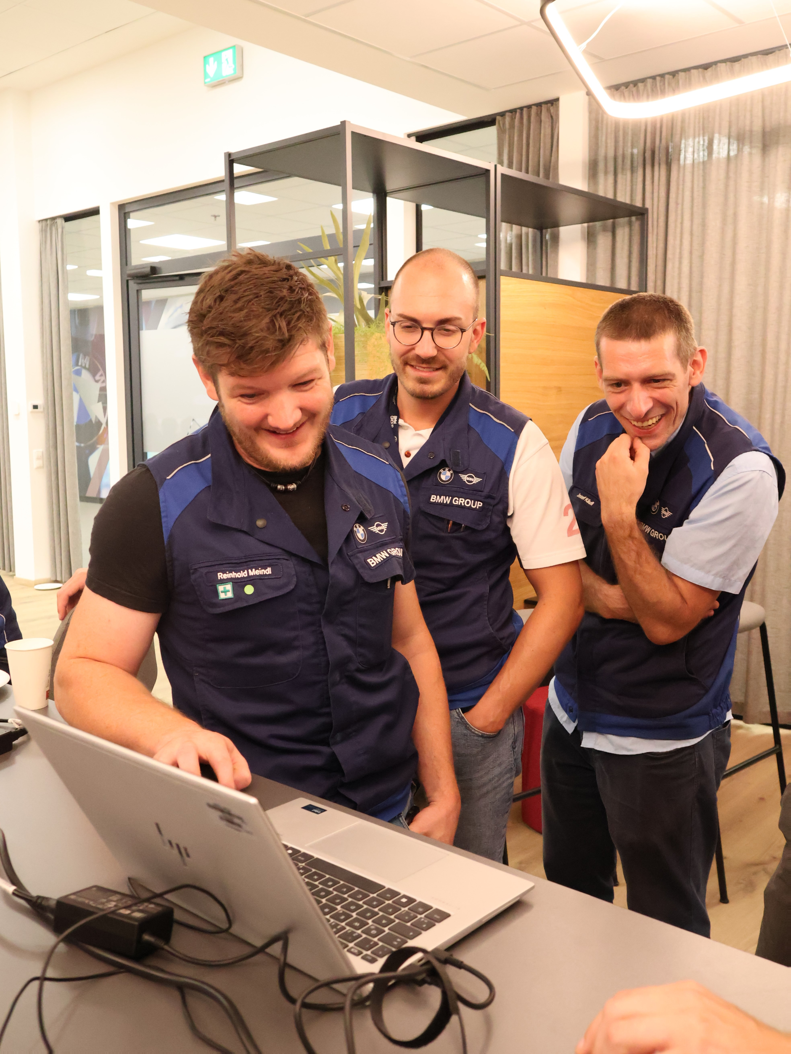
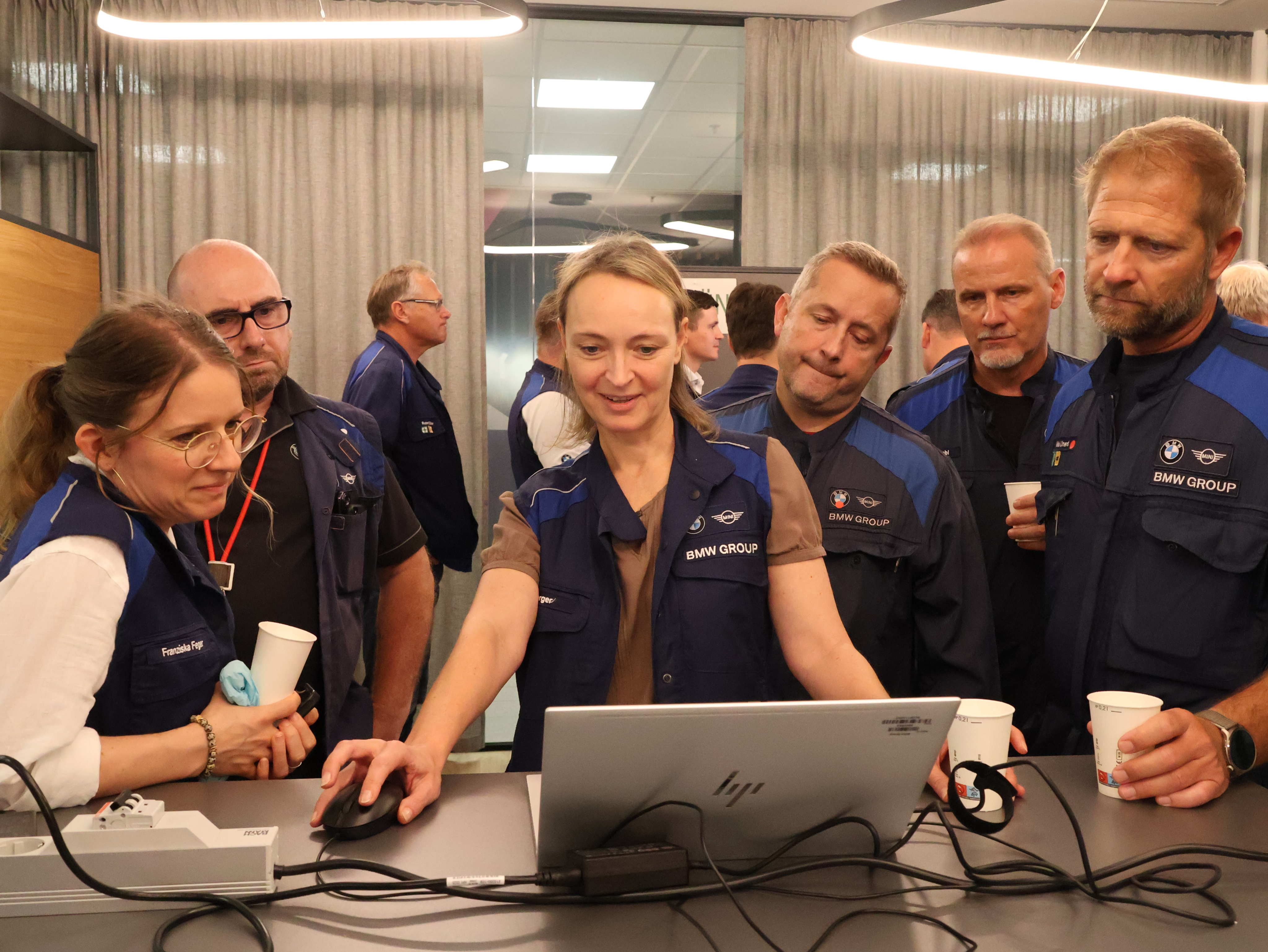
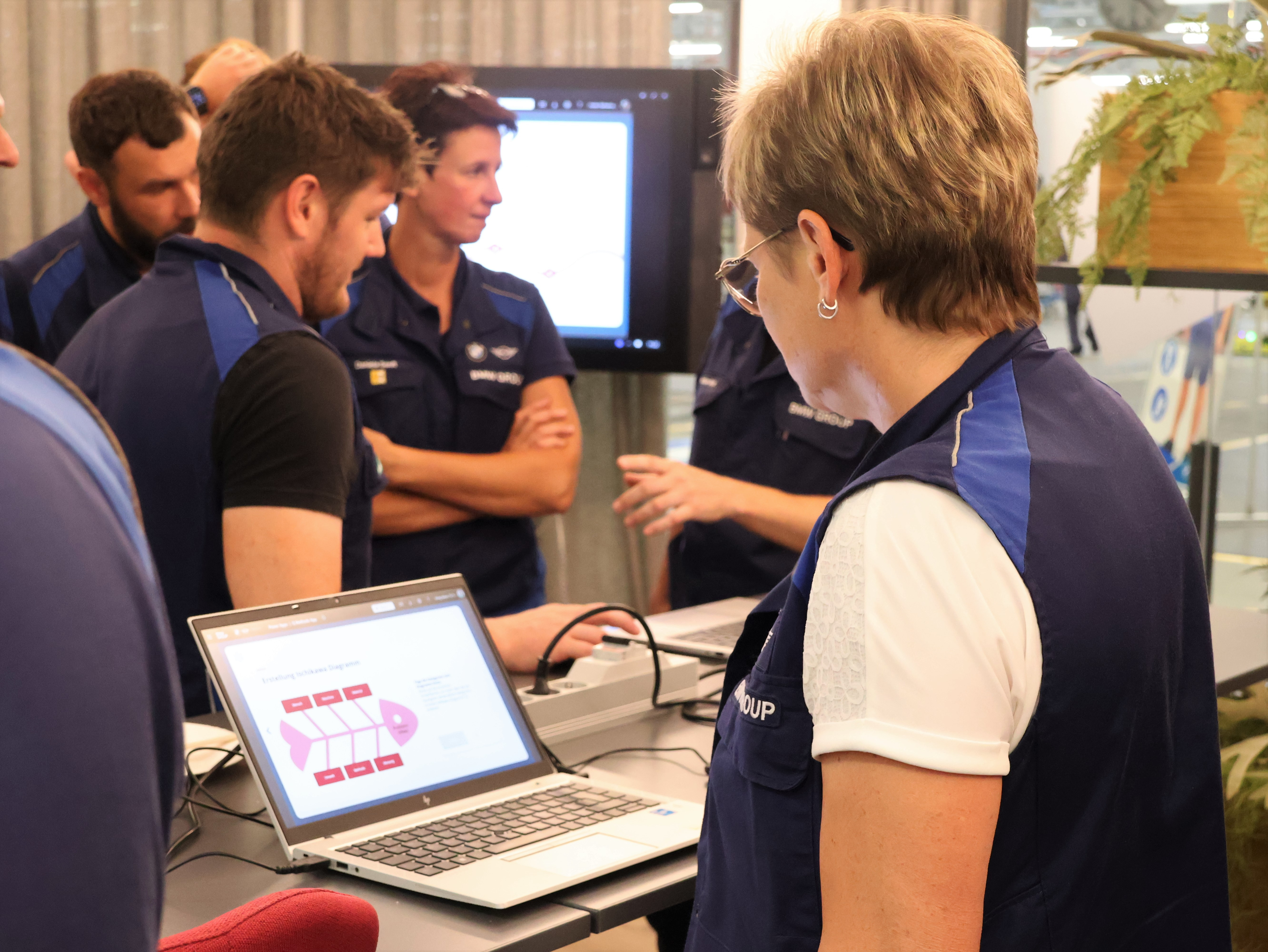
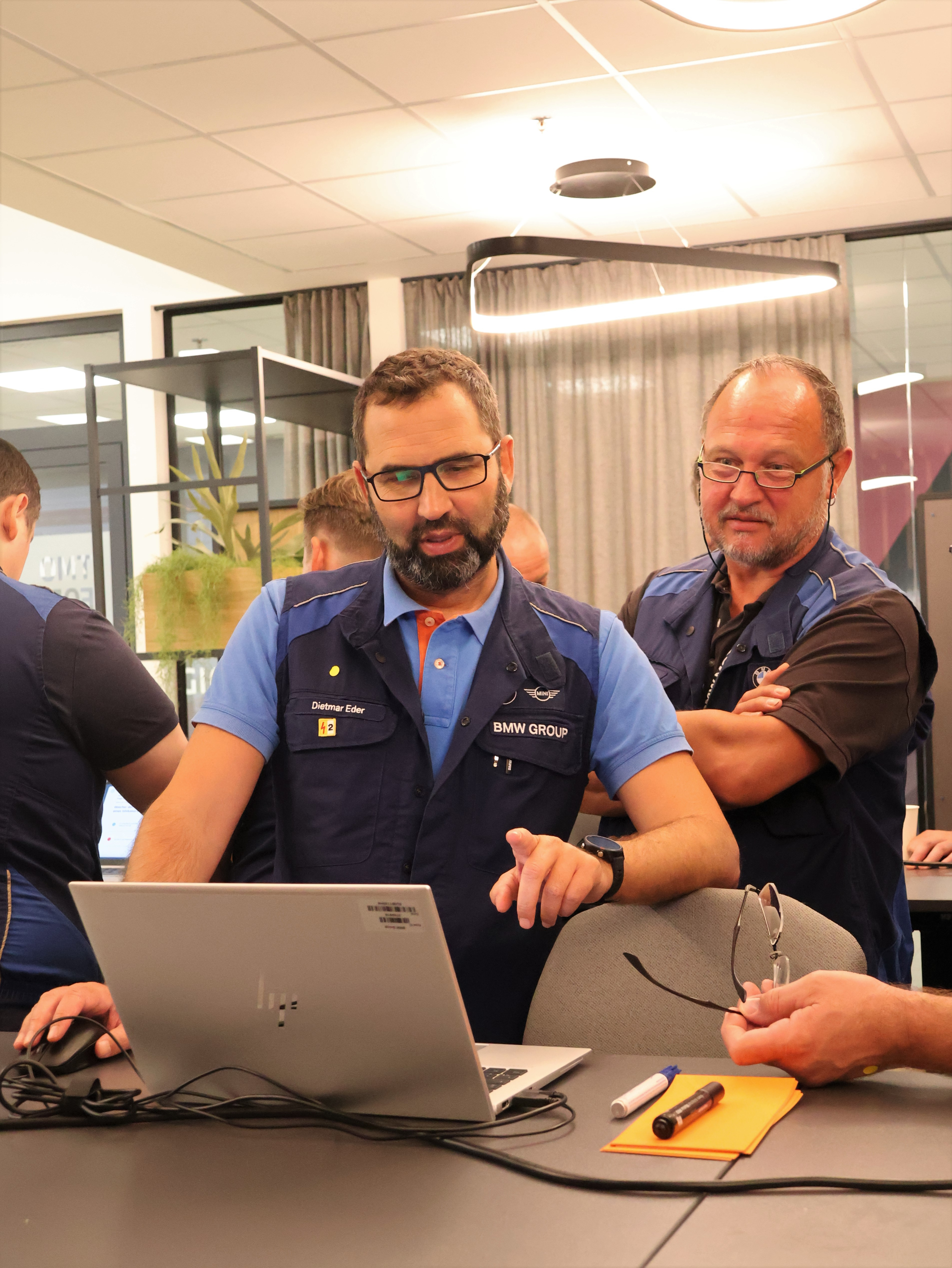
The Q Methods App received its first official reveal after the design renewal, presented at the Forum
Photographed by Yeeun Hong

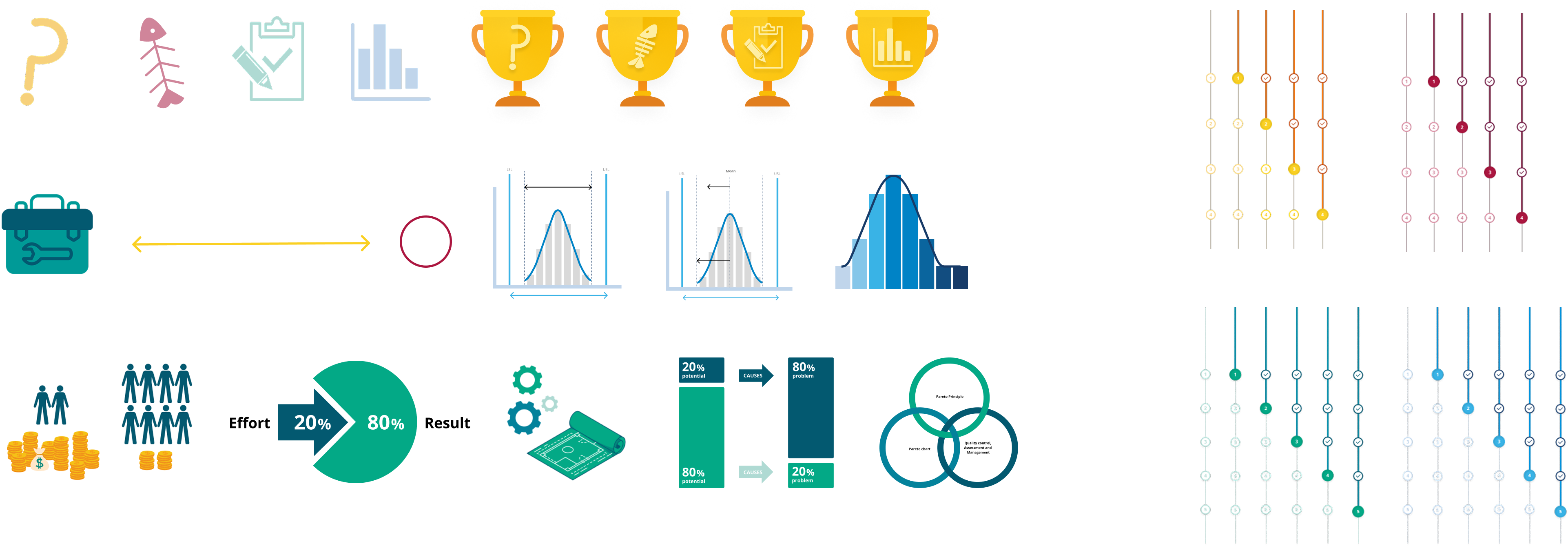
Illustrations & Infographics
Yeeun [Jezz] Hong
Digital Product Designer
©2025 All rights reserved
